باص عمان – القدس... شهيد الزمن

تاريخ النشر : الأربعاء 10:50 25-2-2026
No Image

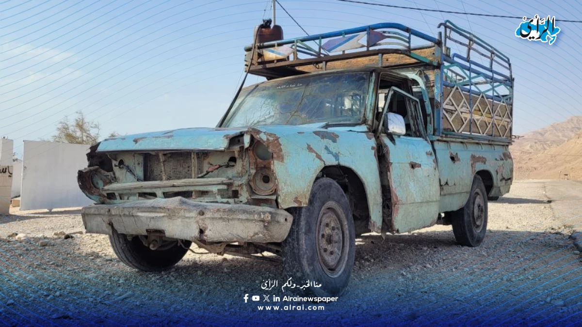
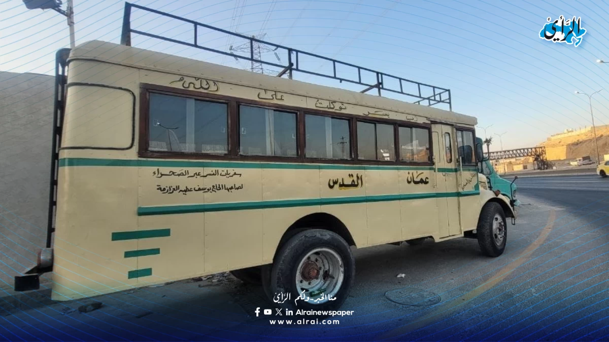
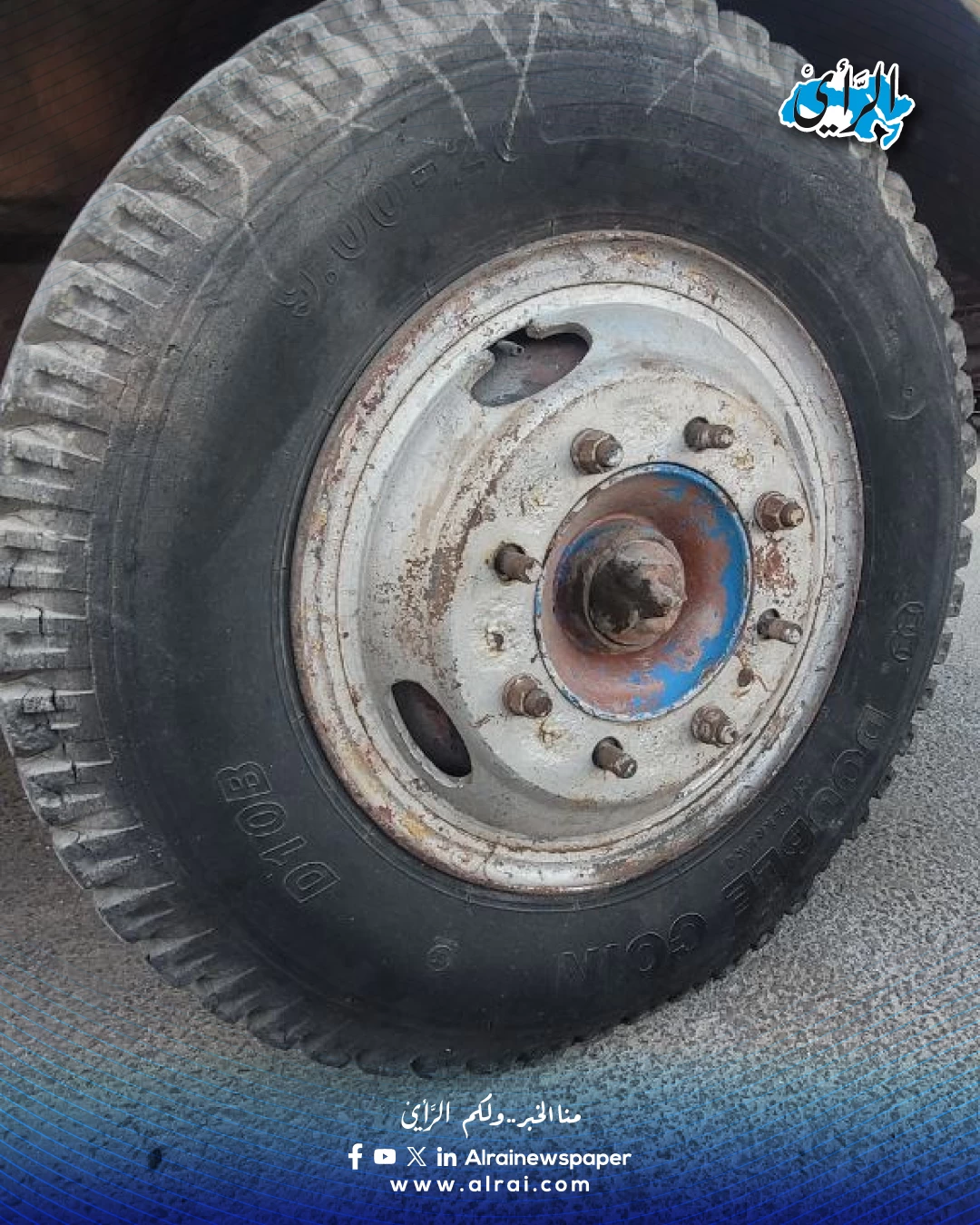
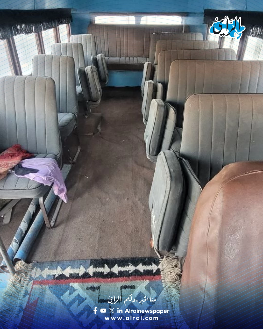
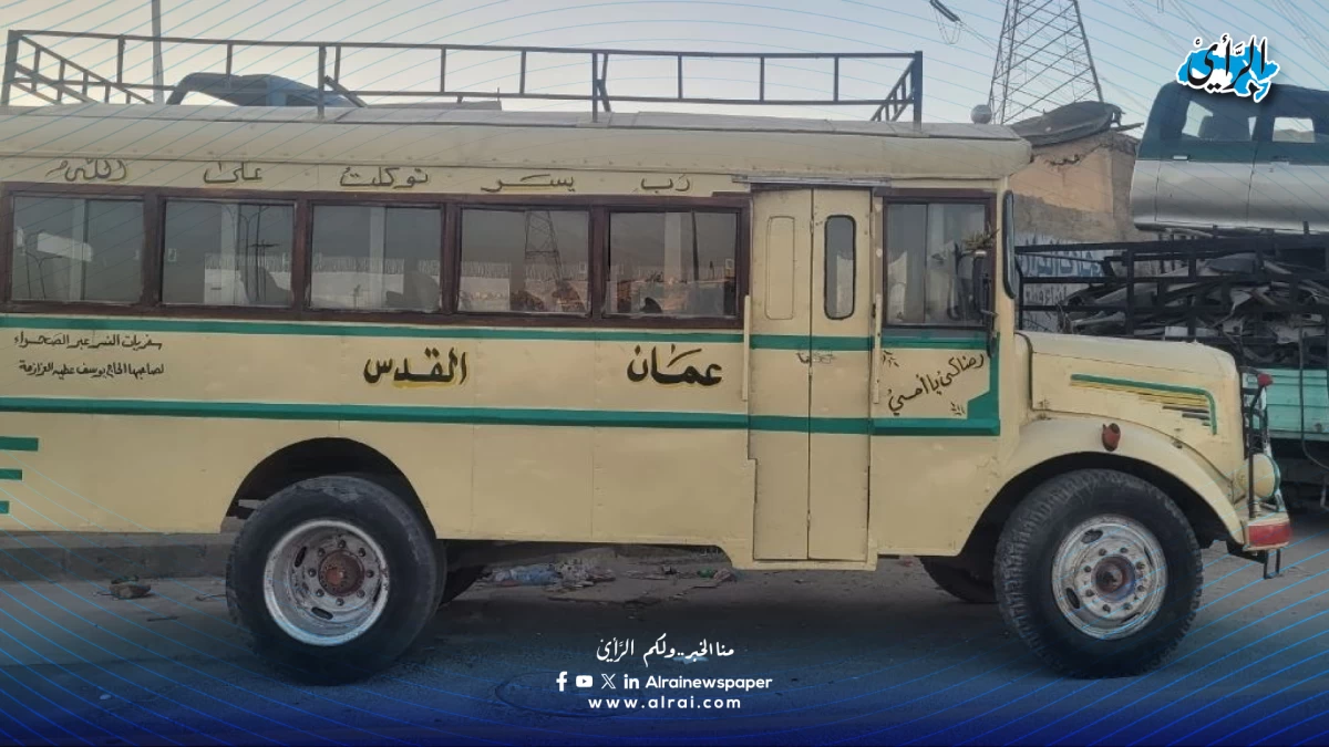
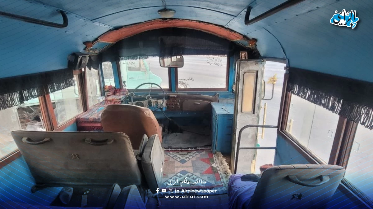
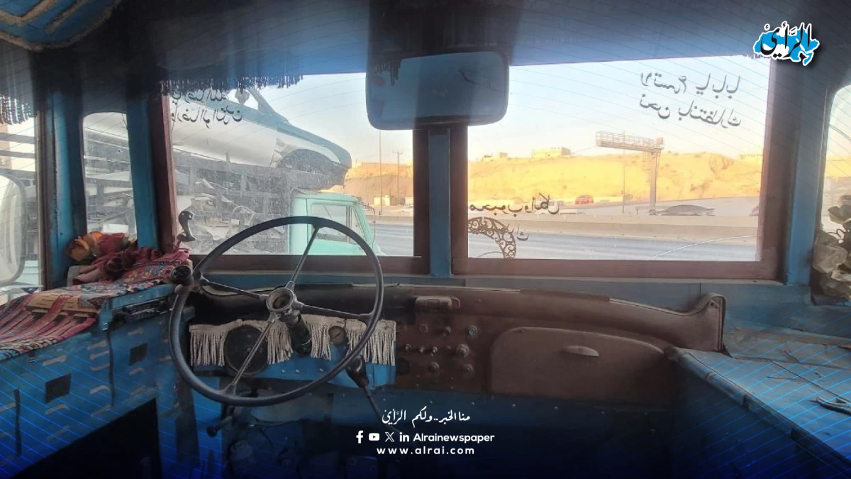
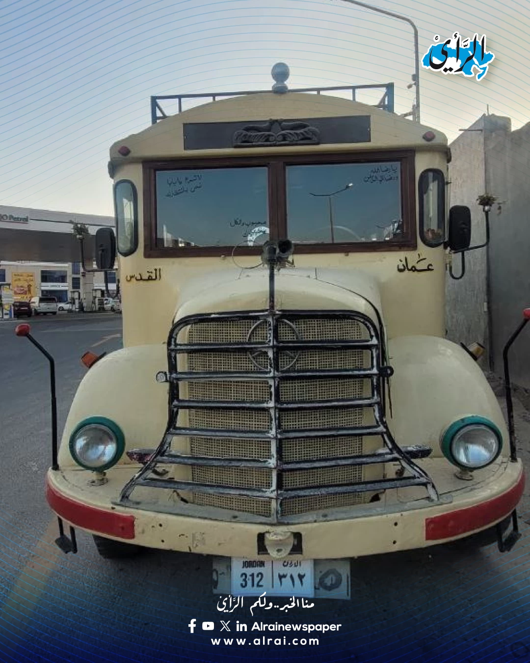
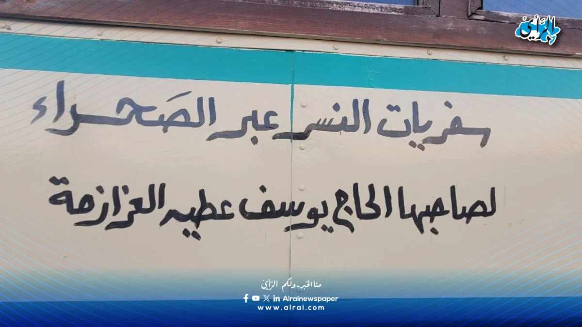
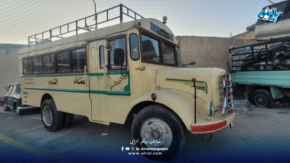
باص عمان – القدس… كان يوصل الركاب بين المدينتين في خمسينيات القرن الماضي، واليوم يقف صامتًا على قارعة الطريق، يراقبه المارة وكأن الزمن توقف عنده. ذكرى تتجول بين العجلات والبوابات، تنتظر من يحييها من جديد

No Image

No Image

No Image

No Image

No Image

No Image

No Image

No Image

No Image

.alrai-epaper-widget{margin-top: 20px; max-width:250px}
Tweets by alrai
.alrai-facebook-embed{margin-top: 70px;}
.container .row .col-md-12:has(.alrai-section-last-widget) { flex-direction: column; } .alrai-section-last-widget { margin: 0 auto; position: relative; padding-top: 35px; width: 100%; } #widget_2097 .alrai-section-last-widget { padding-top: 35px; margin-top: 0; } .alrai-section-last-widget::after { position: absolute; content: url("https://alrai.com/alraijordan/uploads/global_files/section-page-faded-line.svg?v=1"); top: 0; transform: translateX(0); } .alrai-section-last-widget .full-col { overflow-x: auto; overflow-y: hidden; -webkit-overflow-scrolling: touch; width: 100%; } .alrai-section-last-widget .row-element { width: 100%; } .alrai-section-last-widget .content-wrapper { display: flex; flex-direction: row; flex-wrap: nowrap; align-items: stretch; width: max-content; min-width: 100%; gap: 30px; justify-content: center; padding-top: 30px; } .alrai-section-last-widget .item-row { flex: 0 0 auto; width: 200px; margin-right: 7px; display: flex; flex-direction: column; height: 195px; } .alrai-section-last-widget .row-element .item-row .img-ratio { padding-bottom: 100%; display: flex; } .alrai-section-last-widget .row-element .item-row .img-ratio img { border-radius: 50%; border: 2px solid #00a0e5; padding: 3px; } .alrai-section-last-widget .article-title { white-space: nowrap; overflow: hidden; text-overflow: ellipsis; display: block; } .alrai-section-last-widget .item-row .item-info a { color: #000; color: color(display-p3 0 0 0); text-align: center; font-size: 14px; font-style: normal; font-weight: 800; line-height: 20px; text-decoration: none; display: -webkit-box; -webkit-line-clamp: 3; -webkit-box-orient: vertical; overflow: hidden; white-space: normal; } .alrai-section-last-widget .full-col::-webkit-scrollbar { display: none; } @media screen and (min-width: 1200px) { .alrai-section-last-widget::after { transform: translateX(0); } } @media screen and (max-width: 768px) { .alrai-section-last-widget .row-element .content-wrapper { flex-direction: row !important; } .alrai-section-last-widget::after { transform: translateX(100%); right: 0; left: 0; } }
.death-statistics-marquee .article-title a, .death-statistics-marquee .title-widget-2 a { text-align: right; font-family: Cairo; font-style: normal; font-weight: 700; line-height: 25px; text-decoration: none; } .death-statistics-marquee .breaking-news-wrapper { width: 100%; display: flex; } .death-statistics-marquee .breaking-news { background-color: #7c0000; padding: 22px 17px 24px 18px; color: #fff; text-align: right; font-family: Cairo; font-size: 22px; font-weight: 700; line-height: 25px; } .death-statistics-marquee .breaking-news-content { background-color: #b90000; padding: 22px 18px 24px 21px; color: #fff; text-align: right; font-family: Cairo; font-size: 22px; font-weight: 700; line-height: 25px; width: 100%; position: relative; } .full-container .marquee-container-widget:not(.relative-widget) .wrapper-row { position: fixed; width: 100%; right: 0; bottom: 0; z-index: 100000; } .death-statistics-marquee .marquee-container-widget .title-widget-2 { width: 75px; background-color: #757575; color: #fff; height: 60px; display: flex; align-items: center; justify-content: center; } .death-statistics-marquee .title-widget-2 a { color: #fff; color: color(display-p3 1 1 1); font-size: 15px; padding: 16px 18px 16px 15px; display: block; } .death-statistics-marquee .content-row:not(.content-row-full) { width: calc(100% - 100px); background-color: #000; } .death-statistics-marquee .content-row marquee { direction: ltr; } .death-statistics-marquee .content-row .img-item { display: inline-flex; height: 60px; align-items: center; vertical-align: top; } .death-statistics-marquee .content-row .article-title { height: 60px; display: inline-flex; align-items: center; color: #fff; padding: 0 15px; direction: rtl; } .death-statistics-marquee .article-title a { color: #fff; color: color(display-p3 1 1 1); font-size: 17px; } .death-statistics-marquee .title-widget-2 { width: 100px; } #widget_1932 { position: static; bottom: 0; width: 100%; z-index: 1; } @media scren and (max-width:768px){ .death-statistics-marquee .breaking-news-content{ font-family: 'Cairo', sans-serif; } }