الأمانة تدعو المواطنين للاستفادة من الخصومات و الإعفاءات على ضريبة الأبنية والأراضي

تاريخ النشر : الثلاثاء 01:05 10-11-2026
No Image

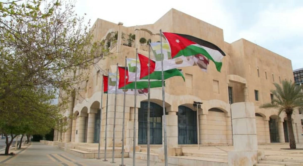
أكدت أمانة عمان الكبرى على استمرارية تمديد العمل بمنح الخصومات والإعفاءات على الضرائب والرسوم المستحقة على ضريبة الأبنية والأراضي (المسقفات) و التحققات حتى نهاية دوام يوم 31/12/2026، وذلك استنادًا إلى قرار مجلس الوزراء الصادر بتاريخ 14/6/2026.

ويأتي قرار التمديد لغايات تخفيف الأعباء عن المواطنين والأنشطة الاقتصادية، وتشجيعهم على تسديد التزاماتهم المالية المترتبة لصالح أمانة عمان.

واوضحت الامانة ان القرار يشمل منح خصم على ضريبة الأبنية والأراضي (المسقفات ) وضريبة المعارف ورسوم مساهمة الصرف الصحي للسنوات السابقة المفروضة على الأراضي والعقارات داخل حدود البلديات وأمانة عمّان الكبرى بنسبة 20% في حال تسديد الضرائب والرسوم المستحقة عن الأعوام السابقة.

و يشمل الإعفاء من غرامات ضريبة الأبنية والأراضي (المسقفات) وضريبة المعارف عن جميع السنوات السابقة بنسبة 100% في حال تسديد الضرائب والرسوم المستحقة عن الأعوام السابقة .

كما يتضمن منح المكلفين خصماً على رسوم التحققات والعوائد والتعويضات بنسبة 25%، و منح طالبي شراء الفضلات خصماً بنسبة 25 % .

و ينص القرار على إعفاء مستأجري العقارات والأبنية العائدة ملكيتها لأمانة عمّان مما نسبته 25% من الأجور المترتبة عليهم والمستحقة لغاية تاريخ 31/12/2025 شريطة أن يتم دفعها بالكامل .

واكدت الامانة أن القرار يمنح المواطنين إمكانية تقسيط جميع المبالغ المستحقة أعلاه حتى نهاية دوام يوم 31/12/2026.

.alrai-epaper-widget{margin-top: 20px; max-width:250px}
Tweets by alrai
.alrai-facebook-embed{margin-top: 70px;}
.container .row .col-md-12:has(.alrai-section-last-widget) { flex-direction: column; } .alrai-section-last-widget { margin: 0 auto; position: relative; padding-top: 35px; width: 100%; } #widget_2097 .alrai-section-last-widget { padding-top: 35px; margin-top: 0; } .alrai-section-last-widget::after { position: absolute; content: url("https://alrai.com/alraijordan/uploads/global_files/section-page-faded-line.svg?v=1"); top: 0; transform: translateX(0); } .alrai-section-last-widget .full-col { overflow-x: auto; overflow-y: hidden; -webkit-overflow-scrolling: touch; width: 100%; } .alrai-section-last-widget .row-element { width: 100%; } .alrai-section-last-widget .content-wrapper { display: flex; flex-direction: row; flex-wrap: nowrap; align-items: stretch; width: max-content; min-width: 100%; gap: 30px; justify-content: center; padding-top: 30px; } .alrai-section-last-widget .item-row { flex: 0 0 auto; width: 200px; margin-right: 7px; display: flex; flex-direction: column; height: 195px; } .alrai-section-last-widget .row-element .item-row .img-ratio { padding-bottom: 100%; display: flex; } .alrai-section-last-widget .row-element .item-row .img-ratio img { border-radius: 50%; border: 2px solid #00a0e5; padding: 3px; } .alrai-section-last-widget .article-title { white-space: nowrap; overflow: hidden; text-overflow: ellipsis; display: block; } .alrai-section-last-widget .item-row .item-info a { color: #000; color: color(display-p3 0 0 0); text-align: center; font-size: 14px; font-style: normal; font-weight: 800; line-height: 20px; text-decoration: none; display: -webkit-box; -webkit-line-clamp: 3; -webkit-box-orient: vertical; overflow: hidden; white-space: normal; } .alrai-section-last-widget .full-col::-webkit-scrollbar { display: none; } @media screen and (min-width: 1200px) { .alrai-section-last-widget::after { transform: translateX(0); } } @media screen and (max-width: 768px) { .alrai-section-last-widget .row-element .content-wrapper { flex-direction: row !important; } .alrai-section-last-widget::after { transform: translateX(100%); right: 0; left: 0; } }
.death-statistics-marquee .article-title a, .death-statistics-marquee .title-widget-2 a { text-align: right; font-family: Cairo; font-style: normal; font-weight: 700; line-height: 25px; text-decoration: none; } .death-statistics-marquee .breaking-news-wrapper { width: 100%; display: flex; } .death-statistics-marquee .breaking-news { background-color: #7c0000; padding: 22px 17px 24px 18px; color: #fff; text-align: right; font-family: Cairo; font-size: 22px; font-weight: 700; line-height: 25px; } .death-statistics-marquee .breaking-news-content { background-color: #b90000; padding: 22px 18px 24px 21px; color: #fff; text-align: right; font-family: Cairo; font-size: 22px; font-weight: 700; line-height: 25px; width: 100%; position: relative; } .full-container .marquee-container-widget:not(.relative-widget) .wrapper-row { position: fixed; width: 100%; right: 0; bottom: 0; z-index: 100000; } .death-statistics-marquee .marquee-container-widget .title-widget-2 { width: 75px; background-color: #757575; color: #fff; height: 60px; display: flex; align-items: center; justify-content: center; } .death-statistics-marquee .title-widget-2 a { color: #fff; color: color(display-p3 1 1 1); font-size: 15px; padding: 16px 18px 16px 15px; display: block; } .death-statistics-marquee .content-row:not(.content-row-full) { width: calc(100% - 100px); background-color: #000; } .death-statistics-marquee .content-row marquee { direction: ltr; } .death-statistics-marquee .content-row .img-item { display: inline-flex; height: 60px; align-items: center; vertical-align: top; } .death-statistics-marquee .content-row .article-title { height: 60px; display: inline-flex; align-items: center; color: #fff; padding: 0 15px; direction: rtl; } .death-statistics-marquee .article-title a { color: #fff; color: color(display-p3 1 1 1); font-size: 17px; } .death-statistics-marquee .title-widget-2 { width: 100px; } #widget_1932 { position: static; bottom: 0; width: 100%; z-index: 1; } @media scren and (max-width:768px){ .death-statistics-marquee .breaking-news-content{ font-family: 'Cairo', sans-serif; } }