"المرأة العربية في السينما" حوار مفتوح حول الصورة والواقع في مهرجان أفلام المرأة

تاريخ النشر : الخميس 08:58 4-6-2026
عمان - فاتن الكوري 

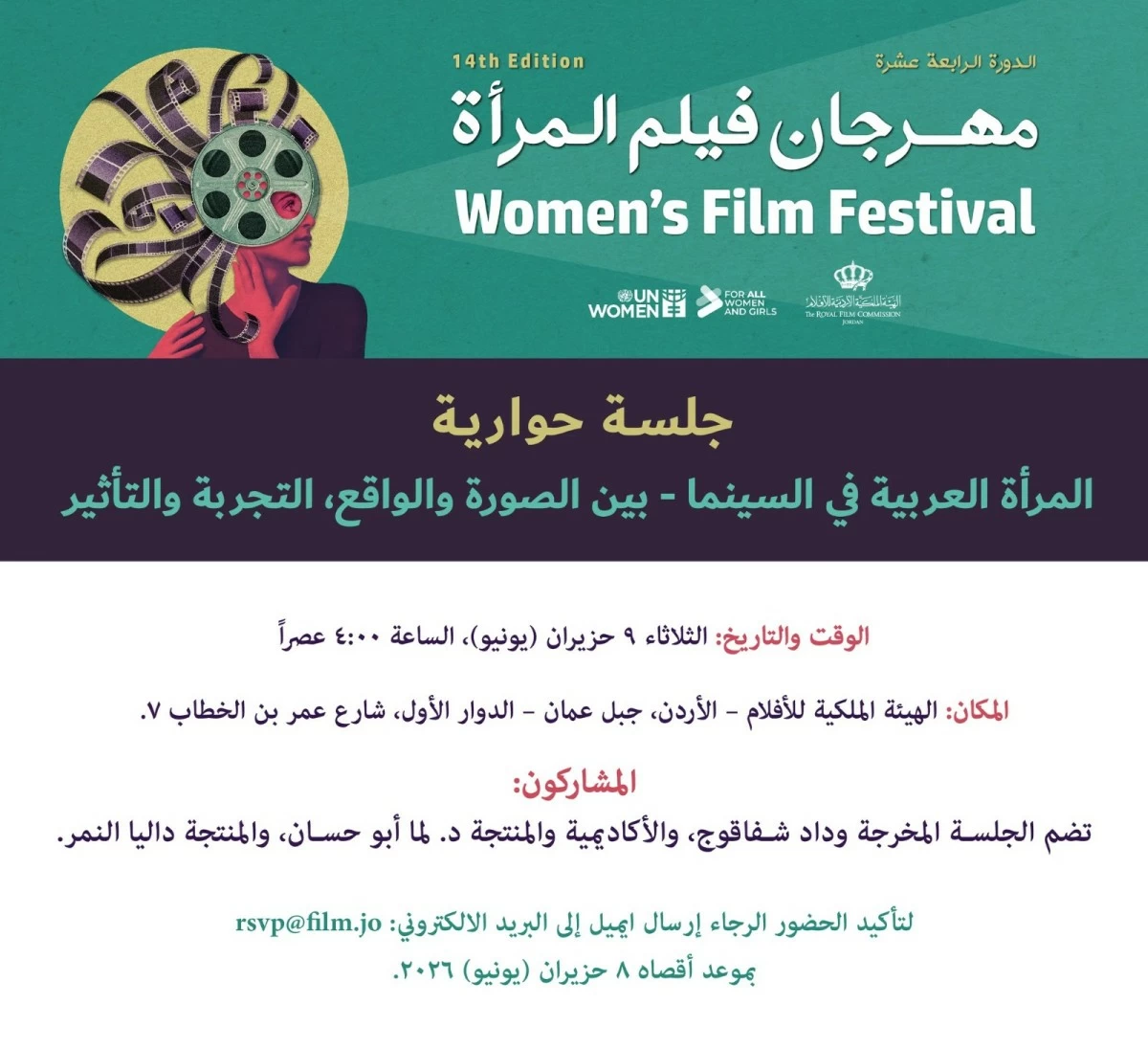
تنظم الهيئة الملكية الأردنية للأفلام، ضمن فعاليات الدورة الرابعة عشرة من مهرجان أفلام المرأة، جلسة حوارية بعنوان "المرأة العربية في السينما: بين الصورة والواقع، التجربة والتأثير" وذلك مساء الثلاثاء 9 حزيران في مقر الهيئة بجبل عمان.

وتهدف الجلسة إلى فتح نقاش عام حول صورة المرأة العربية في السينما العربية والعالمية، واستكشاف التحولات التي شهدها تمثيلها على الشاشة، إلى جانب تسليط الضوء على تجارب النساء العاملات في صناعة الأفلام والتحديات المهنية والإنتاجية والاجتماعية التي تواجههن.

ويتناول المشاركون في الجلسة عدداً من المحاور، من أبرزها الصور النمطية المرتبطة بالمرأة العربية في الأعمال السينمائية، ودور السينما في تشكيل الوعي المجتمعي تجاه قضايا المرأة، إضافة إلى إسهامات المخرجات والمنتجات وصانعات الأفلام في تطوير الخطاب السينمائي العربي وتعزيز التنوع والعدالة في التمثيل البصري.

ويدير الجلسة المخرج محمد الرحاحلةً بمشاركة المخرجة وداد شفاقوج والأكاديمية والمنتجة د.لما أبو حسان، والمنتجة داليا النمر، حيث يستعرضن تجاربهن المهنية ورؤيتهن للتحولات التي شهدها حضور المرأة في صناعة السينما خلال السنوات الأخيرة.

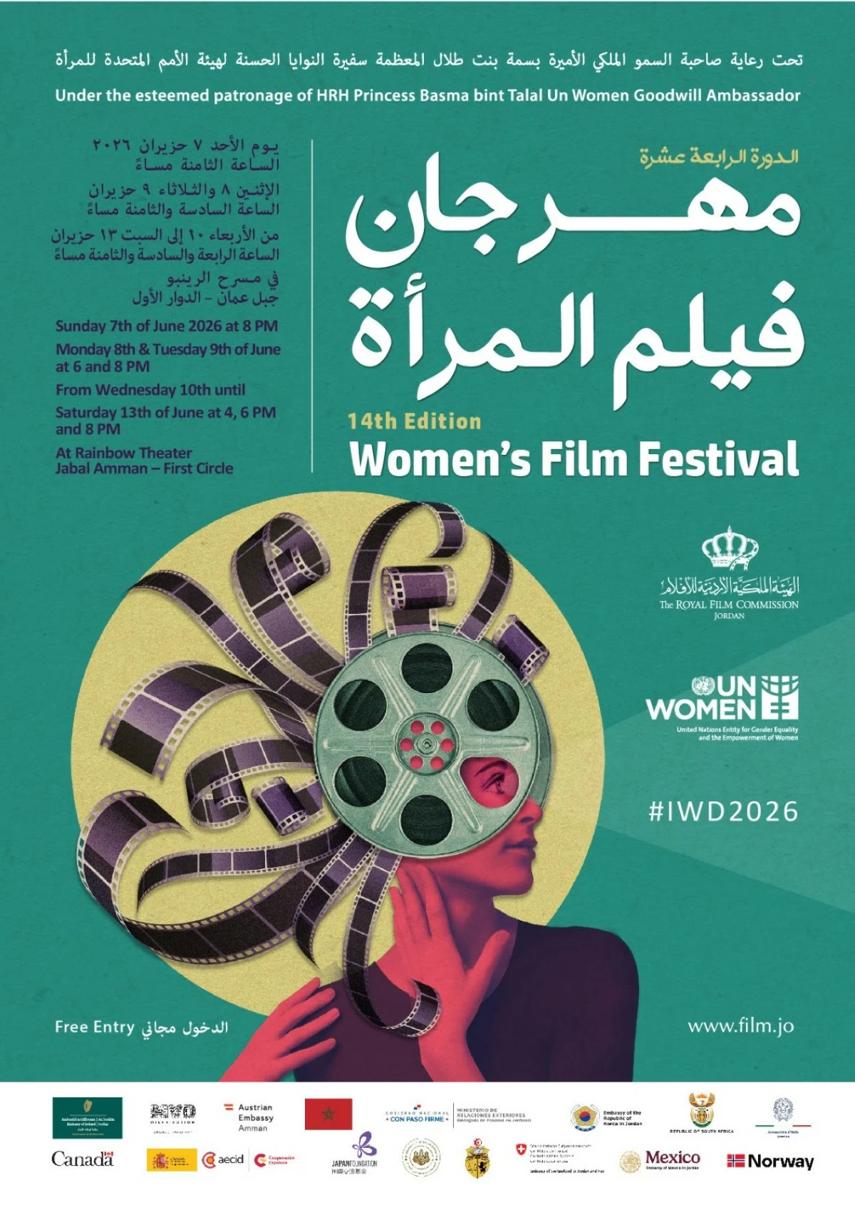
وتأتي الجلسة ضمن البرنامج الثقافي المصاحب لمهرجان أفلام المرأة الذي تنظمه هيئة الأمم المتحدة للمرأة بالتعاون مع الهيئة الملكية الأردنية للأفلام وعدد من الشركاء برعاية سمو الأميرة بسمة بنت طلال سفيرة النوايا الحسنة لهيئة الأمم المتحدة للمرأة.

ويقدم المهرجان على مدى خمسة أيام مجموعة من الأفلام الروائية والوثائقية من مختلف دول العالم، تتناول قضايا المرأة والتمكين والعدالة الاجتماعية وتجارب النساء في مواجهة التحديات الإنسانية والمجتمعية، إلى جانب جلسات نقاشية وفعاليات ثقافية تسعى إلى تعزيز الحوار حول قضايا المرأة ودورها في المجتمعات المعاصرة.

.alrai-epaper-widget{margin-top: 20px; max-width:250px}
Tweets by alrai
.alrai-facebook-embed{margin-top: 70px;}
.container .row .col-md-12:has(.alrai-section-last-widget) { flex-direction: column; } .alrai-section-last-widget { margin: 0 auto; position: relative; padding-top: 35px; width: 100%; } #widget_2097 .alrai-section-last-widget { padding-top: 35px; margin-top: 0; } .alrai-section-last-widget::after { position: absolute; content: url("https://alrai.com/alraijordan/uploads/global_files/section-page-faded-line.svg?v=1"); top: 0; transform: translateX(0); } .alrai-section-last-widget .full-col { overflow-x: auto; overflow-y: hidden; -webkit-overflow-scrolling: touch; width: 100%; } .alrai-section-last-widget .row-element { width: 100%; } .alrai-section-last-widget .content-wrapper { display: flex; flex-direction: row; flex-wrap: nowrap; align-items: stretch; width: max-content; min-width: 100%; gap: 30px; justify-content: center; padding-top: 30px; } .alrai-section-last-widget .item-row { flex: 0 0 auto; width: 200px; margin-right: 7px; display: flex; flex-direction: column; height: 195px; } .alrai-section-last-widget .row-element .item-row .img-ratio { padding-bottom: 100%; display: flex; } .alrai-section-last-widget .row-element .item-row .img-ratio img { border-radius: 50%; border: 2px solid #00a0e5; padding: 3px; } .alrai-section-last-widget .article-title { white-space: nowrap; overflow: hidden; text-overflow: ellipsis; display: block; } .alrai-section-last-widget .item-row .item-info a { color: #000; color: color(display-p3 0 0 0); text-align: center; font-size: 14px; font-style: normal; font-weight: 800; line-height: 20px; text-decoration: none; display: -webkit-box; -webkit-line-clamp: 3; -webkit-box-orient: vertical; overflow: hidden; white-space: normal; } .alrai-section-last-widget .full-col::-webkit-scrollbar { display: none; } @media screen and (min-width: 1200px) { .alrai-section-last-widget::after { transform: translateX(0); } } @media screen and (max-width: 768px) { .alrai-section-last-widget .row-element .content-wrapper { flex-direction: row !important; } .alrai-section-last-widget::after { transform: translateX(100%); right: 0; left: 0; } }
.death-statistics-marquee .article-title a, .death-statistics-marquee .title-widget-2 a { text-align: right; font-family: Cairo; font-style: normal; font-weight: 700; line-height: 25px; text-decoration: none; } .death-statistics-marquee .breaking-news-wrapper { width: 100%; display: flex; } .death-statistics-marquee .breaking-news { background-color: #7c0000; padding: 22px 17px 24px 18px; color: #fff; text-align: right; font-family: Cairo; font-size: 22px; font-weight: 700; line-height: 25px; } .death-statistics-marquee .breaking-news-content { background-color: #b90000; padding: 22px 18px 24px 21px; color: #fff; text-align: right; font-family: Cairo; font-size: 22px; font-weight: 700; line-height: 25px; width: 100%; position: relative; } .full-container .marquee-container-widget:not(.relative-widget) .wrapper-row { position: fixed; width: 100%; right: 0; bottom: 0; z-index: 100000; } .death-statistics-marquee .marquee-container-widget .title-widget-2 { width: 75px; background-color: #757575; color: #fff; height: 60px; display: flex; align-items: center; justify-content: center; } .death-statistics-marquee .title-widget-2 a { color: #fff; color: color(display-p3 1 1 1); font-size: 15px; padding: 16px 18px 16px 15px; display: block; } .death-statistics-marquee .content-row:not(.content-row-full) { width: calc(100% - 100px); background-color: #000; } .death-statistics-marquee .content-row marquee { direction: ltr; } .death-statistics-marquee .content-row .img-item { display: inline-flex; height: 60px; align-items: center; vertical-align: top; } .death-statistics-marquee .content-row .article-title { height: 60px; display: inline-flex; align-items: center; color: #fff; padding: 0 15px; direction: rtl; } .death-statistics-marquee .article-title a { color: #fff; color: color(display-p3 1 1 1); font-size: 17px; } .death-statistics-marquee .title-widget-2 { width: 100px; } #widget_1932 { position: static; bottom: 0; width: 100%; z-index: 1; } @media scren and (max-width:768px){ .death-statistics-marquee .breaking-news-content{ font-family: 'Cairo', sans-serif; } }