جامعة البترا تنظم المسابقة الأولى لقسم الإذاعة والتلفزيون احتفاء بإبداعات الطلبة

تاريخ النشر : الخميس 02:53 22-1-2026
No Image

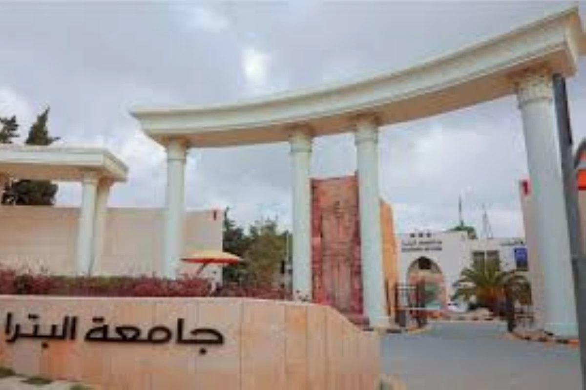
ستعقد كلية الإعلام في جامعة البترا، ممثلة بـ قسم الإذاعة والتلفزيون، المسابقة الأولى للقسم، وذلك يوم الثلاثاء الموافق 3/2/2026 عند الساعة الثانية ظهرا، على مسرح الأنباط في حرم الجامعة، تحت رعاية سعادة الأستاذ الدكتور علي نجادات عميد كلية الإعلام.

وتهدف المسابقة إلى الاحتفاء بإبداعات طلبة قسم الإذاعة والتلفزيون، وتكريم جهودهم المتميزة في مجالات العمل الإعلامي المختلفة، من خلال عرض نتاجاتهم العملية التي تعكس مهاراتهم الأكاديمية والتطبيقية، ضمن بيئة تنافسية تشجع على الإبداع والابتكار.

وتتضمن المسابقة عددا من الفئات، من أبرزها:

أفضل فيلم وثائقي، أفضل تقرير تلفزيوني، أفضل برنامج إذاعي، أفضل برنامج تلفزيوني، أفضل فيديو كليب، أفضل مذيع، وأفضل مذيعة.

وفي هذا السياق، أكدت الدكتورة هديل شقير، رئيسة قسم الإذاعة والتلفزيون في كلية الإعلام – جامعة البترا، أن هذه المسابقة تأتي في إطار رؤية القسم الهادفة إلى دعم المواهب الطلابية وصقل قدراتهم المهنية، مشيرة إلى أن القسم يولي أهمية كبيرة لربط الجانب النظري بالجانب العملي في العملية التعليمية.

وقالت شقير:

“نسعى من خلال هذه المسابقة إلى توفير مساحة حقيقية لطلبتنا لعرض أعمالهم الإعلامية أمام جمهور أكاديمي ومهني، بما يعزز ثقتهم بأنفسهم ويؤهلهم للانخراط في سوق العمل الإعلامي بكفاءة، فالتعلم الحقيقي في الإعلام لا يكتمل إلا بالممارسة والتجربة الميدانية.”

وأضافت أن المسابقة تمثل محطة مهمة في مسار الطلبة الأكاديمي، وفرصة لتكريس ثقافة التميز والتنافس الإيجابي، مؤكدة حرص القسم على الاستمرار في تنظيم مثل هذه الفعاليات التي تعزز الشراكة بين الجامعة والقطاع الإعلامي.

وتأتي هذه المسابقة ضمن سلسلة أنشطة نوعية تنفذها كلية الإعلام في جامعة البترا، انسجاما مع توجهات الجامعة في دعم التعليم التطبيقي وتمكين الطلبة من تحويل المعرفة النظرية إلى مهارات عملية قابلة للتطبيق.

.alrai-epaper-widget{margin-top: 20px; max-width:250px}
Tweets by alrai
.alrai-facebook-embed{margin-top: 70px;}
.container .row .col-md-12:has(.alrai-section-last-widget) { flex-direction: column; } .alrai-section-last-widget { margin: 0 auto; position: relative; padding-top: 35px; width: 100%; } #widget_2097 .alrai-section-last-widget { padding-top: 35px; margin-top: 0; } .alrai-section-last-widget::after { position: absolute; content: url("https://alrai.com/alraijordan/uploads/global_files/section-page-faded-line.svg?v=1"); top: 0; transform: translateX(0); } .alrai-section-last-widget .full-col { overflow-x: auto; overflow-y: hidden; -webkit-overflow-scrolling: touch; width: 100%; } .alrai-section-last-widget .row-element { width: 100%; } .alrai-section-last-widget .content-wrapper { display: flex; flex-direction: row; flex-wrap: nowrap; align-items: stretch; width: max-content; min-width: 100%; gap: 30px; justify-content: center; padding-top: 30px; } .alrai-section-last-widget .item-row { flex: 0 0 auto; width: 200px; margin-right: 7px; display: flex; flex-direction: column; height: 195px; } .alrai-section-last-widget .row-element .item-row .img-ratio { padding-bottom: 100%; display: flex; } .alrai-section-last-widget .row-element .item-row .img-ratio img { border-radius: 50%; border: 2px solid #00a0e5; padding: 3px; } .alrai-section-last-widget .article-title { white-space: nowrap; overflow: hidden; text-overflow: ellipsis; display: block; } .alrai-section-last-widget .item-row .item-info a { color: #000; color: color(display-p3 0 0 0); text-align: center; font-size: 14px; font-style: normal; font-weight: 800; line-height: 20px; text-decoration: none; display: -webkit-box; -webkit-line-clamp: 3; -webkit-box-orient: vertical; overflow: hidden; white-space: normal; } .alrai-section-last-widget .full-col::-webkit-scrollbar { display: none; } @media screen and (min-width: 1200px) { .alrai-section-last-widget::after { transform: translateX(0); } } @media screen and (max-width: 768px) { .alrai-section-last-widget .row-element .content-wrapper { flex-direction: row !important; } .alrai-section-last-widget::after { transform: translateX(100%); right: 0; left: 0; } }
.death-statistics-marquee .article-title a, .death-statistics-marquee .title-widget-2 a { text-align: right; font-family: Cairo; font-style: normal; font-weight: 700; line-height: 25px; text-decoration: none; } .death-statistics-marquee .breaking-news-wrapper { width: 100%; display: flex; } .death-statistics-marquee .breaking-news { background-color: #7c0000; padding: 22px 17px 24px 18px; color: #fff; text-align: right; font-family: Cairo; font-size: 22px; font-weight: 700; line-height: 25px; } .death-statistics-marquee .breaking-news-content { background-color: #b90000; padding: 22px 18px 24px 21px; color: #fff; text-align: right; font-family: Cairo; font-size: 22px; font-weight: 700; line-height: 25px; width: 100%; position: relative; } .full-container .marquee-container-widget:not(.relative-widget) .wrapper-row { position: fixed; width: 100%; right: 0; bottom: 0; z-index: 100000; } .death-statistics-marquee .marquee-container-widget .title-widget-2 { width: 75px; background-color: #757575; color: #fff; height: 60px; display: flex; align-items: center; justify-content: center; } .death-statistics-marquee .title-widget-2 a { color: #fff; color: color(display-p3 1 1 1); font-size: 15px; padding: 16px 18px 16px 15px; display: block; } .death-statistics-marquee .content-row:not(.content-row-full) { width: calc(100% - 100px); background-color: #000; } .death-statistics-marquee .content-row marquee { direction: ltr; } .death-statistics-marquee .content-row .img-item { display: inline-flex; height: 60px; align-items: center; vertical-align: top; } .death-statistics-marquee .content-row .article-title { height: 60px; display: inline-flex; align-items: center; color: #fff; padding: 0 15px; direction: rtl; } .death-statistics-marquee .article-title a { color: #fff; color: color(display-p3 1 1 1); font-size: 17px; } .death-statistics-marquee .title-widget-2 { width: 100px; } #widget_1932 { position: static; bottom: 0; width: 100%; z-index: 1; } @media scren and (max-width:768px){ .death-statistics-marquee .breaking-news-content{ font-family: 'Cairo', sans-serif; } }