فريق من ((الأردنية)) إلى المرحلة العالمية في تحدي ناسا

تاريخ النشر : السبت 11:01 18-10-2025
No Image

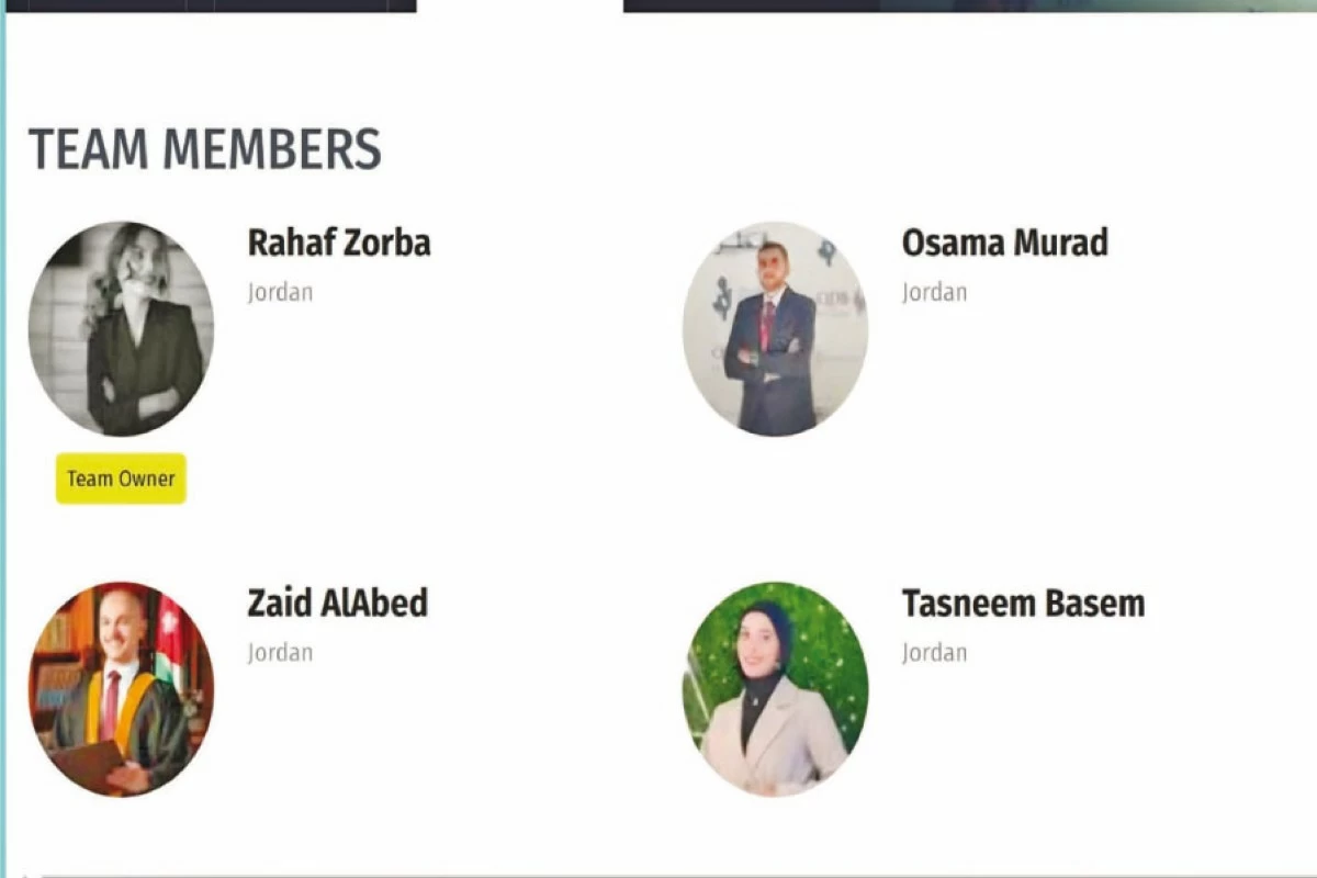
تأهل فريق طلابي مكوَّن من مجموعة من الطلبة المبدعين إلى المرحلة العالمية من تحدي NASA Space Apps Challenge 2025، وهو أكبر هاكاثون عالمي تنظمه وكالة الفضاء الأمريكية (ناسا) بمشاركة عدد من الفرق من مختلف دول العالم لتطوير حلول مبتكرة باستخدام بيانات ومصادر مفتوحة.

وضم الفريق الطالبة رهف زوربا من تخصص هندسة العمارة، والطالب أسامة مراد من تخصص ماجستير إدارة الأعمال والطالب زيد العبد من تخصص الطب، والطالبة تسنيم باسم من تخصص هندسة الحاسوب.

وتضمن التحدي هذا العام 18 محورًا من أبرزها: الذكاء الاصطناعي وتعلم الآلة، علوم البيانات، البرمجة وتطوير المواقع الالكترونية، السرد القصصي والإعلام المتعدد، إضافة إلى مجالات الاستدامة البيئية والزراعة، وهو المجال الذي ركّز عليه الفريق في مشروعه.

وفي التفاصيل عن آلية التأهل من المرحلة المحلية إلى العالمية فتمت على مرحلتين حيث كانت المرحلة الأولى تقديم الفكرة ليتم تقييمها من قِبل لجنة التحكيم المختصة.

أما المرحلة الثانية فتضمنت الهاكاثون الافتراضي، حيث بدأ الفريق بتطوير فكرته وإنشاء نموذج عملي يعتمد على بيانات مفتوحة من وكالة ناسا، ثم عرض المشروع أمام لجنة التحكيم العالمية التي اختارت الفريق للتأهل للعالمية.

ويُعد هذا الإنجاز خطوة مهمة في تعزيز حضور الجامعة الأردنية وطلبتها في المحافل التقنية والعلمية العالمية، وإبراز قدراتهم في مجالات الابتكار والتقنيات المستقبلية.

.alrai-epaper-widget{margin-top: 20px; max-width:250px}
Tweets by alrai
.alrai-facebook-embed{margin-top: 70px;}
.container .row .col-md-12:has(.alrai-section-last-widget) { flex-direction: column; } .alrai-section-last-widget { margin: 0 auto; position: relative; padding-top: 35px; width: 100%; } #widget_2097 .alrai-section-last-widget { padding-top: 35px; margin-top: 0; } .alrai-section-last-widget::after { position: absolute; content: url("https://alrai.com/alraijordan/uploads/global_files/section-page-faded-line.svg?v=1"); top: 0; transform: translateX(0); } .alrai-section-last-widget .full-col { overflow-x: auto; overflow-y: hidden; -webkit-overflow-scrolling: touch; width: 100%; } .alrai-section-last-widget .row-element { width: 100%; } .alrai-section-last-widget .content-wrapper { display: flex; flex-direction: row; flex-wrap: nowrap; align-items: stretch; width: max-content; min-width: 100%; gap: 30px; justify-content: center; padding-top: 30px; } .alrai-section-last-widget .item-row { flex: 0 0 auto; width: 200px; margin-right: 7px; display: flex; flex-direction: column; height: 195px; } .alrai-section-last-widget .row-element .item-row .img-ratio { padding-bottom: 100%; display: flex; } .alrai-section-last-widget .row-element .item-row .img-ratio img { border-radius: 50%; border: 2px solid #00a0e5; padding: 3px; } .alrai-section-last-widget .article-title { white-space: nowrap; overflow: hidden; text-overflow: ellipsis; display: block; } .alrai-section-last-widget .item-row .item-info a { color: #000; color: color(display-p3 0 0 0); text-align: center; font-size: 14px; font-style: normal; font-weight: 800; line-height: 20px; text-decoration: none; display: -webkit-box; -webkit-line-clamp: 3; -webkit-box-orient: vertical; overflow: hidden; white-space: normal; } .alrai-section-last-widget .full-col::-webkit-scrollbar { display: none; } @media screen and (min-width: 1200px) { .alrai-section-last-widget::after { transform: translateX(0); } } @media screen and (max-width: 768px) { .alrai-section-last-widget .row-element .content-wrapper { flex-direction: row !important; } .alrai-section-last-widget::after { transform: translateX(100%); right: 0; left: 0; } }
.death-statistics-marquee .article-title a, .death-statistics-marquee .title-widget-2 a { text-align: right; font-family: Cairo; font-style: normal; font-weight: 700; line-height: 25px; text-decoration: none; } .death-statistics-marquee .breaking-news-wrapper { width: 100%; display: flex; } .death-statistics-marquee .breaking-news { background-color: #7c0000; padding: 22px 17px 24px 18px; color: #fff; text-align: right; font-family: Cairo; font-size: 22px; font-weight: 700; line-height: 25px; } .death-statistics-marquee .breaking-news-content { background-color: #b90000; padding: 22px 18px 24px 21px; color: #fff; text-align: right; font-family: Cairo; font-size: 22px; font-weight: 700; line-height: 25px; width: 100%; position: relative; } .full-container .marquee-container-widget:not(.relative-widget) .wrapper-row { position: fixed; width: 100%; right: 0; bottom: 0; z-index: 100000; } .death-statistics-marquee .marquee-container-widget .title-widget-2 { width: 75px; background-color: #757575; color: #fff; height: 60px; display: flex; align-items: center; justify-content: center; } .death-statistics-marquee .title-widget-2 a { color: #fff; color: color(display-p3 1 1 1); font-size: 15px; padding: 16px 18px 16px 15px; display: block; } .death-statistics-marquee .content-row:not(.content-row-full) { width: calc(100% - 100px); background-color: #000; } .death-statistics-marquee .content-row marquee { direction: ltr; } .death-statistics-marquee .content-row .img-item { display: inline-flex; height: 60px; align-items: center; vertical-align: top; } .death-statistics-marquee .content-row .article-title { height: 60px; display: inline-flex; align-items: center; color: #fff; padding: 0 15px; direction: rtl; } .death-statistics-marquee .article-title a { color: #fff; color: color(display-p3 1 1 1); font-size: 17px; } .death-statistics-marquee .title-widget-2 { width: 100px; } #widget_1932 { position: static; bottom: 0; width: 100%; z-index: 1; } @media scren and (max-width:768px){ .death-statistics-marquee .breaking-news-content{ font-family: 'Cairo', sans-serif; } }