"سوا" معرض يمني حول الترابط الاجتماعي في المتحف الوطني

تاريخ النشر : الأحد 11:15 28-9-2025
No Image

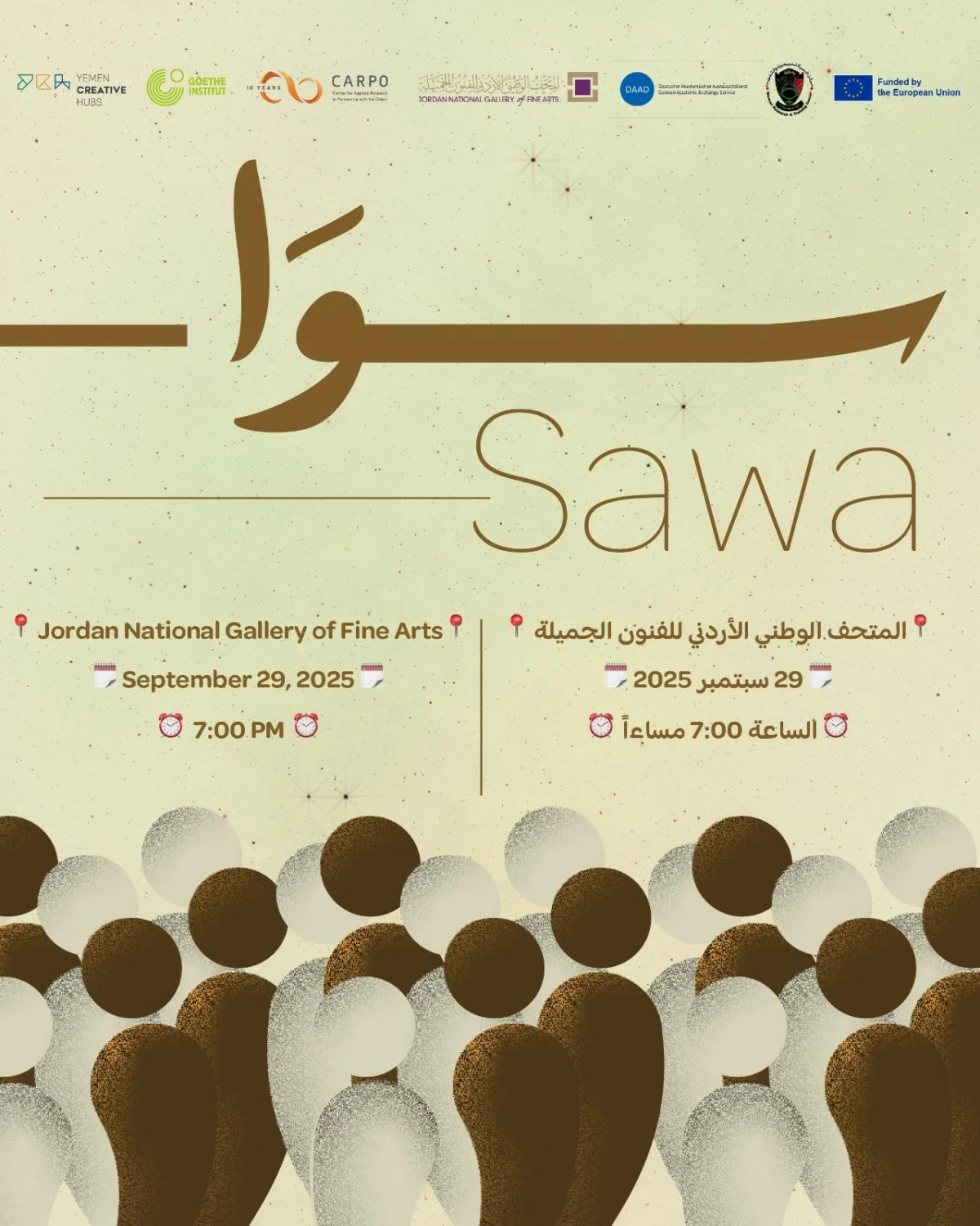
بتنظيم من المتحف الوطني الاردني للفنون الجميلة وبالتعاون مع معهد "غوته" الالماني بعمان يفتتح المعرض الفني "سوا" الساعة 7 مساء يوم الاثنين 29/9/2025 في المتحف الوطني الاردني للفنون الجميلة/ مبنى1. وهو معرض حول الترابط الاجتماعي في اليمن من خلال الفن والمنتجات المعرفية.

"سوا" (بمعنى معًا) هو معرض يلتقي فيه نتاج مشروعين ثقافيين من اليمن، ليكشف كيف تستطيع الأصوات الفنية أن تشيّد جسورًا للوصل في قلب واقع معقّد.

من خلال التصوير الفوتوغرافي، والسينما، والبودكاست، والموسيقى، والممارسات المجتمعية، يقدّم ثلاثة عشر فنانًا وممارسًا يمنيًا صاعدًا سردياتهم وتجاربهم الخاصة.

لا يقدّم "سوا" حكاية منفصلة واحدة، بل يفتح فضاءً رحبًا لتعدد الأصوات، حيث تتجاور التجارب السردية في العمل المشترك: بين المراكز الإبداعية، والتبادلات المعرفية، وورش العمل.

وبلغة متفرّدة لكل فنان، يلتقي الجميع عند غاية واحدة: تحويل الثقافة إلى مساحة للتواصل والحوار، وإلى طاقة جمعية للمقاومة والإبداع.

في ثنياته، يتحدى "سوا" فكرة الفن كترف هامشي، يعيد موضعة الممارسات الفنية بوصفها أداة فاعلة لتوثيق التجارب، ولجمع المجتمعات، ولابتكار أشكال جديدة من الوحدة والعيش معًا.

يحكي لنا "سوا" أن الوحدة ليست حالة ساكنة، بل حركة دائمة تتشكل عبر ممارسات يومية مقصودة، تترك بصماتها في تفاصيل الحياة العادية، حيث يغدو الفن وسيلة لإعادة تخيّل الاجتماع الإنساني، ومسارًا لبناء رؤى تتجاوز الفرد نحو الجماعة.

يستمر المعرض لغاية 6/10/2025 والدعوة عامة.

.alrai-epaper-widget{margin-top: 20px; max-width:250px}
Tweets by alrai
.alrai-facebook-embed{margin-top: 70px;}
.container .row .col-md-12:has(.alrai-section-last-widget) { flex-direction: column; } .alrai-section-last-widget { margin: 0 auto; position: relative; padding-top: 35px; width: 100%; } #widget_2097 .alrai-section-last-widget { padding-top: 35px; margin-top: 0; } .alrai-section-last-widget::after { position: absolute; content: url("https://alrai.com/alraijordan/uploads/global_files/section-page-faded-line.svg?v=1"); top: 0; transform: translateX(0); } .alrai-section-last-widget .full-col { overflow-x: auto; overflow-y: hidden; -webkit-overflow-scrolling: touch; width: 100%; } .alrai-section-last-widget .row-element { width: 100%; } .alrai-section-last-widget .content-wrapper { display: flex; flex-direction: row; flex-wrap: nowrap; align-items: stretch; width: max-content; min-width: 100%; gap: 30px; justify-content: center; padding-top: 30px; } .alrai-section-last-widget .item-row { flex: 0 0 auto; width: 200px; margin-right: 7px; display: flex; flex-direction: column; height: 195px; } .alrai-section-last-widget .row-element .item-row .img-ratio { padding-bottom: 100%; display: flex; } .alrai-section-last-widget .row-element .item-row .img-ratio img { border-radius: 50%; border: 2px solid #00a0e5; padding: 3px; } .alrai-section-last-widget .article-title { white-space: nowrap; overflow: hidden; text-overflow: ellipsis; display: block; } .alrai-section-last-widget .item-row .item-info a { color: #000; color: color(display-p3 0 0 0); text-align: center; font-size: 14px; font-style: normal; font-weight: 800; line-height: 20px; text-decoration: none; display: -webkit-box; -webkit-line-clamp: 3; -webkit-box-orient: vertical; overflow: hidden; white-space: normal; } .alrai-section-last-widget .full-col::-webkit-scrollbar { display: none; } @media screen and (min-width: 1200px) { .alrai-section-last-widget::after { transform: translateX(0); } } @media screen and (max-width: 768px) { .alrai-section-last-widget .row-element .content-wrapper { flex-direction: row !important; } .alrai-section-last-widget::after { transform: translateX(100%); right: 0; left: 0; } }
.death-statistics-marquee .article-title a, .death-statistics-marquee .title-widget-2 a { text-align: right; font-family: Cairo; font-style: normal; font-weight: 700; line-height: 25px; text-decoration: none; } .death-statistics-marquee .breaking-news-wrapper { width: 100%; display: flex; } .death-statistics-marquee .breaking-news { background-color: #7c0000; padding: 22px 17px 24px 18px; color: #fff; text-align: right; font-family: Cairo; font-size: 22px; font-weight: 700; line-height: 25px; } .death-statistics-marquee .breaking-news-content { background-color: #b90000; padding: 22px 18px 24px 21px; color: #fff; text-align: right; font-family: Cairo; font-size: 22px; font-weight: 700; line-height: 25px; width: 100%; position: relative; } .full-container .marquee-container-widget:not(.relative-widget) .wrapper-row { position: fixed; width: 100%; right: 0; bottom: 0; z-index: 100000; } .death-statistics-marquee .marquee-container-widget .title-widget-2 { width: 75px; background-color: #757575; color: #fff; height: 60px; display: flex; align-items: center; justify-content: center; } .death-statistics-marquee .title-widget-2 a { color: #fff; color: color(display-p3 1 1 1); font-size: 15px; padding: 16px 18px 16px 15px; display: block; } .death-statistics-marquee .content-row:not(.content-row-full) { width: calc(100% - 100px); background-color: #000; } .death-statistics-marquee .content-row marquee { direction: ltr; } .death-statistics-marquee .content-row .img-item { display: inline-flex; height: 60px; align-items: center; vertical-align: top; } .death-statistics-marquee .content-row .article-title { height: 60px; display: inline-flex; align-items: center; color: #fff; padding: 0 15px; direction: rtl; } .death-statistics-marquee .article-title a { color: #fff; color: color(display-p3 1 1 1); font-size: 17px; } .death-statistics-marquee .title-widget-2 { width: 100px; } #widget_1932 { position: static; bottom: 0; width: 100%; z-index: 1; } @media scren and (max-width:768px){ .death-statistics-marquee .breaking-news-content{ font-family: 'Cairo', sans-serif; } }