70 برنامجاً سنوياً في مركز شباب وشابات سوف

تاريخ النشر : الثلاثاء 03:17 23-9-2025
No Image
جرش- راشد علي فريحات

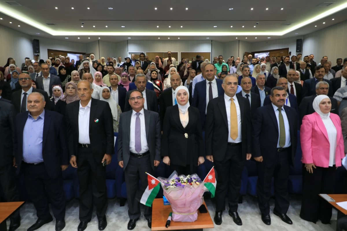
ينفذ مركز شباب وشابات سوف في محافظة جرش نحو 70 برنامجاً سنوياً تستهدف الفئة العمرية من 12–34 عاماً للذكور والإناث ضمن خطة عمل متكاملة تراعي احتياجات الشباب وتلبي تطلعاتهم.

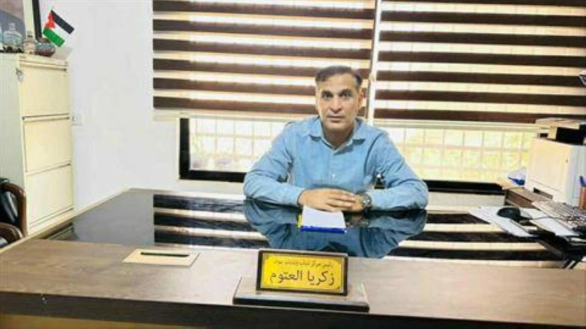
وقال مدير المركز زكريا العتوم في حديث إن وزارة الشباب ترصد مبلغ 8000 دينار سنوياً للمركز بواقع 4000 دينار للذكور و4000 دينار للإناث فيما تنفذ مبادرات أخرى تطوعية بالتعاون مع منظمات وأفراد دون أي تكلفة مالية.

وبين أن مركز شباب وشابات سوف تأسس عام 1968 ليكون من أوائل المراكز الشبابية في المملكة تنفيذاً لرؤية واستراتيجية وزارة الشباب الهادفة إلى إعداد جيل واعٍ ومنتمٍ لوطنه وقيادته الهاشمية الرشيدة وعلى مدار العقود الماضية، ساهم المركز في إخراج قيادات شبابية واعدة، كونه مرفقاً حكومياً خالصاً يعنى بالشباب والشابات في مختلف المجالات.

وأضاف العتوم أن المركز يقدم أنشطة متنوعة تشمل المجالات الرياضية والاقتصادية وريادة الأعمال والابتكار والمهارات الحياتية والتقنية إضافة إلى المعسكرات الشبابية مشيراً إلى أن جوهر العمل يتمثل في تطوير مهارات الشباب وتعزيز وعيهم بما يسهم في تخريج جيل نابذ للعنف والتطرف ومتقبل للآخر.

وأوضح أن المركز يعتمد أساليب متنوعة في برامجه مثل الحوار والتفاعل والتعلم عن طريق اللعب ومحاكاة القضايا الوطنية إلى جانب تقديم برامج فنية وثقافية تناسب مختلف الفئات العمرية.

وأكد العتوم أن عمل المركز يقوم على التشبيك والتعاون مع المؤسسات الحكومية ومنظمات المجتمع المدني والجهات الدولية بما يضمن تقديم خدمات متكاملة تعزز التوعية والتنمية والثقافة والبيئة.

وأشار إلى أن محاور الاستراتيجية الوطنية للشباب تشكل خارطة الطريق لعمل المركز وتشمل: التعليم والتكنولوجيا المواطنة الفاعلة المشاركة والقيادة الريادة والتمكين الاقتصادي الفنون والإعلام الإيجابي الأمن والسلم المجتمعي إضافة إلى الصحة والنشاط البدني.

.alrai-epaper-widget{margin-top: 20px; max-width:250px}
Tweets by alrai
.alrai-facebook-embed{margin-top: 70px;}
.container .row .col-md-12:has(.alrai-section-last-widget) { flex-direction: column; } .alrai-section-last-widget { margin: 0 auto; position: relative; padding-top: 35px; width: 100%; } #widget_2097 .alrai-section-last-widget { padding-top: 35px; margin-top: 0; } .alrai-section-last-widget::after { position: absolute; content: url("https://alrai.com/alraijordan/uploads/global_files/section-page-faded-line.svg?v=1"); top: 0; transform: translateX(0); } .alrai-section-last-widget .full-col { overflow-x: auto; overflow-y: hidden; -webkit-overflow-scrolling: touch; width: 100%; } .alrai-section-last-widget .row-element { width: 100%; } .alrai-section-last-widget .content-wrapper { display: flex; flex-direction: row; flex-wrap: nowrap; align-items: stretch; width: max-content; min-width: 100%; gap: 30px; justify-content: center; padding-top: 30px; } .alrai-section-last-widget .item-row { flex: 0 0 auto; width: 200px; margin-right: 7px; display: flex; flex-direction: column; height: 195px; } .alrai-section-last-widget .row-element .item-row .img-ratio { padding-bottom: 100%; display: flex; } .alrai-section-last-widget .row-element .item-row .img-ratio img { border-radius: 50%; border: 2px solid #00a0e5; padding: 3px; } .alrai-section-last-widget .article-title { white-space: nowrap; overflow: hidden; text-overflow: ellipsis; display: block; } .alrai-section-last-widget .item-row .item-info a { color: #000; color: color(display-p3 0 0 0); text-align: center; font-size: 14px; font-style: normal; font-weight: 800; line-height: 20px; text-decoration: none; display: -webkit-box; -webkit-line-clamp: 3; -webkit-box-orient: vertical; overflow: hidden; white-space: normal; } .alrai-section-last-widget .full-col::-webkit-scrollbar { display: none; } @media screen and (min-width: 1200px) { .alrai-section-last-widget::after { transform: translateX(0); } } @media screen and (max-width: 768px) { .alrai-section-last-widget .row-element .content-wrapper { flex-direction: row !important; } .alrai-section-last-widget::after { transform: translateX(100%); right: 0; left: 0; } }
.death-statistics-marquee .article-title a, .death-statistics-marquee .title-widget-2 a { text-align: right; font-family: Cairo; font-style: normal; font-weight: 700; line-height: 25px; text-decoration: none; } .death-statistics-marquee .breaking-news-wrapper { width: 100%; display: flex; } .death-statistics-marquee .breaking-news { background-color: #7c0000; padding: 22px 17px 24px 18px; color: #fff; text-align: right; font-family: Cairo; font-size: 22px; font-weight: 700; line-height: 25px; } .death-statistics-marquee .breaking-news-content { background-color: #b90000; padding: 22px 18px 24px 21px; color: #fff; text-align: right; font-family: Cairo; font-size: 22px; font-weight: 700; line-height: 25px; width: 100%; position: relative; } .full-container .marquee-container-widget:not(.relative-widget) .wrapper-row { position: fixed; width: 100%; right: 0; bottom: 0; z-index: 100000; } .death-statistics-marquee .marquee-container-widget .title-widget-2 { width: 75px; background-color: #757575; color: #fff; height: 60px; display: flex; align-items: center; justify-content: center; } .death-statistics-marquee .title-widget-2 a { color: #fff; color: color(display-p3 1 1 1); font-size: 15px; padding: 16px 18px 16px 15px; display: block; } .death-statistics-marquee .content-row:not(.content-row-full) { width: calc(100% - 100px); background-color: #000; } .death-statistics-marquee .content-row marquee { direction: ltr; } .death-statistics-marquee .content-row .img-item { display: inline-flex; height: 60px; align-items: center; vertical-align: top; } .death-statistics-marquee .content-row .article-title { height: 60px; display: inline-flex; align-items: center; color: #fff; padding: 0 15px; direction: rtl; } .death-statistics-marquee .article-title a { color: #fff; color: color(display-p3 1 1 1); font-size: 17px; } .death-statistics-marquee .title-widget-2 { width: 100px; } #widget_1932 { position: static; bottom: 0; width: 100%; z-index: 1; } @media scren and (max-width:768px){ .death-statistics-marquee .breaking-news-content{ font-family: 'Cairo', sans-serif; } }