مفاجأة في تصميم "آيفون 17 برو" و"برو ماكس"

تاريخ النشر : الأحد 01:20 7-9-2025
No Image

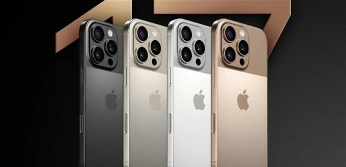
لا يزال هناك بعض الغموض حول التصميم النهائي لهاتفي "آيفون 17 برو" و"17 برو ماكس" قبل حدث آبل الرسمي المزمع يوم الثلاثاء المقبل.

وتشير تقارير جديدة إلى مفاجأة كبيرة في تصميم الطرازين كان هناك خلاف حولها.

وتوجد شائعتان متناقضتان حول تصميم ظهر طرازي "آيفون 17 برو" و"17 برو ماكس"، وكلاهما تتفقان على أن وحدة الكاميرا ستتوسع لتكون شريط بكامل عرض الهاتف في الجزء العلوي.

أما الاختلاف فكان في بقية مساحة ظهر الهاتف؛ فإما سيكون استمرارًا للتصميم الزجاجي كليًا كما في "آيفون 16 برو"، أو تصميم ثنائي اللون يجمع بين الألومنيوم والزجاج مع جزء مخصص "MagSafe"، بحسب تقرير لموقع "9TO5Mac" المتخصص في أخبار التكنولوجيا، اطلعت عليه "العربية Business"

وحتى الآن، بدا التصميم المزودج مجرد تخمين، لكن وفقًا لوكالة بلومبيرغ يبدو أن إعادة التصميم الأكثر جذرية ستحدث بالفعل.

ووفقًا لمارك غورمان من "بلومبرغ" فإن "أحدث الإصدارات عالية المواصفات (من آيفون)، وهما آيفون 17 برو وبرو ماكس، سيكون لهما ظهران جديدان يمنحان مظهرًا حديثًا لمنطقتي الكاميرا".

وأضاف: "ظهر الهواتف يبدو مختلفًا، بما في ذلك منطقة كاميرا جديدة تمتد على طول الثلث العلوي من الجهاز بالإضافة إلى منطقة مفصولة جديدة في الثلثين السفليين من الهاتف تعمل أيضًا كمنطقة للشحن اللاسلكي".

وهذا الوصف يتوافق مع التسريبات التي أشارت إلى تصميم مزودج من الألومنيوم والزجاج، وليس التصميم الزجاجي كليًا كما في "آيفون 16 برو".

وإذا صح هذا الأمر، فإن "أبل" على وشك تقديم أكبر تغيير في تصميم طرازي "آيفون برو" منذ سنوات. وقد يُمهّد هذا الطريق أيضًا لإصدار آيفون 20 المصنوع بالكامل من الزجاج، مع انتقال "أبل" نحو استخدام المزيد من المعدن في هواتف آيفون برو.

وقد يُساعد استخدام الألومنيوم بدلًا من التيتانيوم وتقليل الزجاج المُستخدم في خفض وزن هواتف آيفون برو بشكل ملحوظ. وقد تكون هذه أكبر فروق يمكن ملاحظتها إذا كان هذا التغيير سيحدث بالفعل.

.alrai-epaper-widget{margin-top: 20px; max-width:250px}
Tweets by alrai
.alrai-facebook-embed{margin-top: 70px;}
.container .row .col-md-12:has(.alrai-section-last-widget) { flex-direction: column; } .alrai-section-last-widget { margin: 0 auto; position: relative; padding-top: 35px; width: 100%; } #widget_2097 .alrai-section-last-widget { padding-top: 35px; margin-top: 0; } .alrai-section-last-widget::after { position: absolute; content: url("https://alrai.com/alraijordan/uploads/global_files/section-page-faded-line.svg?v=1"); top: 0; transform: translateX(0); } .alrai-section-last-widget .full-col { overflow-x: auto; overflow-y: hidden; -webkit-overflow-scrolling: touch; width: 100%; } .alrai-section-last-widget .row-element { width: 100%; } .alrai-section-last-widget .content-wrapper { display: flex; flex-direction: row; flex-wrap: nowrap; align-items: stretch; width: max-content; min-width: 100%; gap: 30px; justify-content: center; padding-top: 30px; } .alrai-section-last-widget .item-row { flex: 0 0 auto; width: 200px; margin-right: 7px; display: flex; flex-direction: column; height: 195px; } .alrai-section-last-widget .row-element .item-row .img-ratio { padding-bottom: 100%; display: flex; } .alrai-section-last-widget .row-element .item-row .img-ratio img { border-radius: 50%; border: 2px solid #00a0e5; padding: 3px; } .alrai-section-last-widget .article-title { white-space: nowrap; overflow: hidden; text-overflow: ellipsis; display: block; } .alrai-section-last-widget .item-row .item-info a { color: #000; color: color(display-p3 0 0 0); text-align: center; font-size: 14px; font-style: normal; font-weight: 800; line-height: 20px; text-decoration: none; display: -webkit-box; -webkit-line-clamp: 3; -webkit-box-orient: vertical; overflow: hidden; white-space: normal; } .alrai-section-last-widget .full-col::-webkit-scrollbar { display: none; } @media screen and (min-width: 1200px) { .alrai-section-last-widget::after { transform: translateX(0); } } @media screen and (max-width: 768px) { .alrai-section-last-widget .row-element .content-wrapper { flex-direction: row !important; } .alrai-section-last-widget::after { transform: translateX(100%); right: 0; left: 0; } }
.death-statistics-marquee .article-title a, .death-statistics-marquee .title-widget-2 a { text-align: right; font-family: Cairo; font-style: normal; font-weight: 700; line-height: 25px; text-decoration: none; } .death-statistics-marquee .breaking-news-wrapper { width: 100%; display: flex; } .death-statistics-marquee .breaking-news { background-color: #7c0000; padding: 22px 17px 24px 18px; color: #fff; text-align: right; font-family: Cairo; font-size: 22px; font-weight: 700; line-height: 25px; } .death-statistics-marquee .breaking-news-content { background-color: #b90000; padding: 22px 18px 24px 21px; color: #fff; text-align: right; font-family: Cairo; font-size: 22px; font-weight: 700; line-height: 25px; width: 100%; position: relative; } .full-container .marquee-container-widget:not(.relative-widget) .wrapper-row { position: fixed; width: 100%; right: 0; bottom: 0; z-index: 100000; } .death-statistics-marquee .marquee-container-widget .title-widget-2 { width: 75px; background-color: #757575; color: #fff; height: 60px; display: flex; align-items: center; justify-content: center; } .death-statistics-marquee .title-widget-2 a { color: #fff; color: color(display-p3 1 1 1); font-size: 15px; padding: 16px 18px 16px 15px; display: block; } .death-statistics-marquee .content-row:not(.content-row-full) { width: calc(100% - 100px); background-color: #000; } .death-statistics-marquee .content-row marquee { direction: ltr; } .death-statistics-marquee .content-row .img-item { display: inline-flex; height: 60px; align-items: center; vertical-align: top; } .death-statistics-marquee .content-row .article-title { height: 60px; display: inline-flex; align-items: center; color: #fff; padding: 0 15px; direction: rtl; } .death-statistics-marquee .article-title a { color: #fff; color: color(display-p3 1 1 1); font-size: 17px; } .death-statistics-marquee .title-widget-2 { width: 100px; } #widget_1932 { position: static; bottom: 0; width: 100%; z-index: 1; } @media scren and (max-width:768px){ .death-statistics-marquee .breaking-news-content{ font-family: 'Cairo', sans-serif; } }