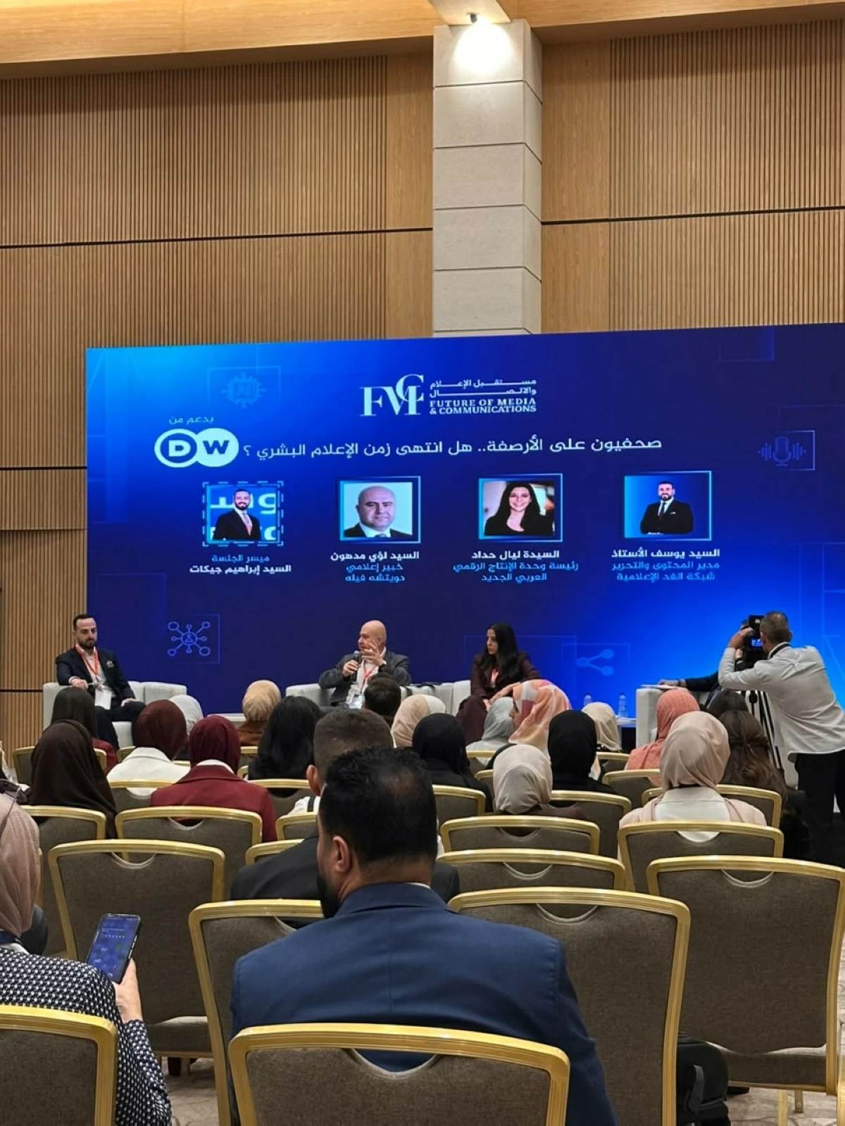
صحفيون على الأرصفة».. هل انتهى زمن الإعلام البشري؟ نقاش حول مستقبل الصحافة في عمّان

تاريخ النشر : السبت 11:24 10-10-2026
No Image

ناقش إعلاميون وخبراء في جلسة حوارية بعنوان «صحفيون على الأرصفة.. هل انتهى زمن الإعلام البشري؟»، مستقبل الصحافة في ظل التحولات المتسارعة التي يشهدها قطاع الإعلام، والتطور المتنامي في أدوات التكنولوجيا والذكاء الاصطناعي، وانعكاساتها على دور الصحفي وآليات إنتاج المحتوى الإعلامي.

وجاءت الجلسة ضمن فعاليات ملتقى مستقبل الإعلام والاتصال الرابع، الذي ينظمه مركز حماية وحرية الصحفيين في فندق اللاند مارك بالعاصمة عمّان، يومي 10 و11 تشرين الأول الحالي، تحت شعار «مستقبل الإعلام والاتصال.. عالم متغيّر».

وسلطت الجلسة الضوء على التحديات التي تواجه الصحفيين والمؤسسات الإعلامية في ظل التغيرات المتسارعة في بيئة العمل الصحفي، وصعود المنصات الرقمية، وتزايد الاعتماد على الأدوات التقنية في إنتاج الأخبار وتداولها، إلى جانب التساؤلات المتعلقة بمستقبل الصحافة التقليدية وقدرتها على مواكبة التحولات الجديدة.

وتبرز أهمية هذا النقاش في ظل التغيرات التي طرأت على علاقة الجمهور بوسائل الإعلام، وتنامي الحاجة إلى محتوى مهني موثوق، قادر على مواكبة سرعة النشر دون التفريط بمعايير الدقة والتحقق والمصداقية.

كما يطرح تطور الذكاء الاصطناعي تساؤلات حول طبيعة العلاقة بين الصحفي والتكنولوجيا، وحدود الاعتماد على الأدوات الحديثة في جمع المعلومات وصياغة المحتوى، ومدى قدرتها على تعويض الدور الإنساني للصحفي في فهم السياقات، والتحقق من الوقائع، ومساءلة المصادر، ونقل القضايا التي تهم المجتمع.

وتأتي هذه النقاشات في وقت تواجه فيه المؤسسات الإعلامية تحديات متزايدة تتعلق باستدامة نماذج العمل الصحفي، وتعزيز ثقة الجمهور، وتطوير المهارات المهنية، ومواكبة التحولات الرقمية، بما يضمن استمرار الصحافة في أداء دورها في نقل المعلومات وتفسير الأحداث ومراقبة الشأن العام.

.alrai-epaper-widget{margin-top: 20px; max-width:250px}
Tweets by alrai
.alrai-facebook-embed{margin-top: 70px;}
.container .row .col-md-12:has(.alrai-section-last-widget) { flex-direction: column; } .alrai-section-last-widget { margin: 0 auto; position: relative; padding-top: 35px; width: 100%; } #widget_2097 .alrai-section-last-widget { padding-top: 35px; margin-top: 0; } .alrai-section-last-widget::after { position: absolute; content: url("https://alrai.com/alraijordan/uploads/global_files/section-page-faded-line.svg?v=1"); top: 0; transform: translateX(0); } .alrai-section-last-widget .full-col { overflow-x: auto; overflow-y: hidden; -webkit-overflow-scrolling: touch; width: 100%; } .alrai-section-last-widget .row-element { width: 100%; } .alrai-section-last-widget .content-wrapper { display: flex; flex-direction: row; flex-wrap: nowrap; align-items: stretch; width: max-content; min-width: 100%; gap: 30px; justify-content: center; padding-top: 30px; } .alrai-section-last-widget .item-row { flex: 0 0 auto; width: 200px; margin-right: 7px; display: flex; flex-direction: column; height: 195px; } .alrai-section-last-widget .row-element .item-row .img-ratio { padding-bottom: 100%; display: flex; } .alrai-section-last-widget .row-element .item-row .img-ratio img { border-radius: 50%; border: 2px solid #00a0e5; padding: 3px; } .alrai-section-last-widget .article-title { white-space: nowrap; overflow: hidden; text-overflow: ellipsis; display: block; } .alrai-section-last-widget .item-row .item-info a { color: #000; color: color(display-p3 0 0 0); text-align: center; font-size: 14px; font-style: normal; font-weight: 800; line-height: 20px; text-decoration: none; display: -webkit-box; -webkit-line-clamp: 3; -webkit-box-orient: vertical; overflow: hidden; white-space: normal; } .alrai-section-last-widget .full-col::-webkit-scrollbar { display: none; } @media screen and (min-width: 1200px) { .alrai-section-last-widget::after { transform: translateX(0); } } @media screen and (max-width: 768px) { .alrai-section-last-widget .row-element .content-wrapper { flex-direction: row !important; } .alrai-section-last-widget::after { transform: translateX(100%); right: 0; left: 0; } }
.death-statistics-marquee .article-title a, .death-statistics-marquee .title-widget-2 a { text-align: right; font-family: Cairo; font-style: normal; font-weight: 700; line-height: 25px; text-decoration: none; } .death-statistics-marquee .breaking-news-wrapper { width: 100%; display: flex; } .death-statistics-marquee .breaking-news { background-color: #7c0000; padding: 22px 17px 24px 18px; color: #fff; text-align: right; font-family: Cairo; font-size: 22px; font-weight: 700; line-height: 25px; } .death-statistics-marquee .breaking-news-content { background-color: #b90000; padding: 22px 18px 24px 21px; color: #fff; text-align: right; font-family: Cairo; font-size: 22px; font-weight: 700; line-height: 25px; width: 100%; position: relative; } .full-container .marquee-container-widget:not(.relative-widget) .wrapper-row { position: fixed; width: 100%; right: 0; bottom: 0; z-index: 100000; } .death-statistics-marquee .marquee-container-widget .title-widget-2 { width: 75px; background-color: #757575; color: #fff; height: 60px; display: flex; align-items: center; justify-content: center; } .death-statistics-marquee .title-widget-2 a { color: #fff; color: color(display-p3 1 1 1); font-size: 15px; padding: 16px 18px 16px 15px; display: block; } .death-statistics-marquee .content-row:not(.content-row-full) { width: calc(100% - 100px); background-color: #000; } .death-statistics-marquee .content-row marquee { direction: ltr; } .death-statistics-marquee .content-row .img-item { display: inline-flex; height: 60px; align-items: center; vertical-align: top; } .death-statistics-marquee .content-row .article-title { height: 60px; display: inline-flex; align-items: center; color: #fff; padding: 0 15px; direction: rtl; } .death-statistics-marquee .article-title a { color: #fff; color: color(display-p3 1 1 1); font-size: 17px; } .death-statistics-marquee .title-widget-2 { width: 100px; } #widget_1932 { position: static; bottom: 0; width: 100%; z-index: 1; } @media scren and (max-width:768px){ .death-statistics-marquee .breaking-news-content{ font-family: 'Cairo', sans-serif; } }