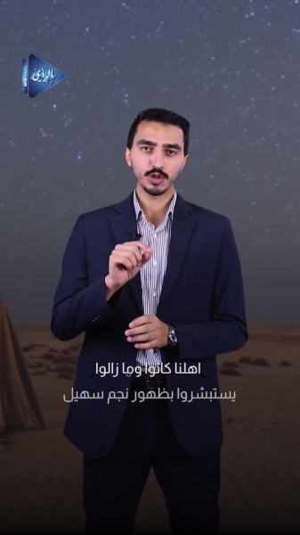
لو بتقدر ترجع بالزمن… شو كنت رح تغيّر؟

تاريخ النشر : الاثنين 07:33 14-9-2026
جاري تحميل ...

لو بتقدر ترجع بالزمن… شو كنت رح تغيّر؟

من تجارب العمر، حكي من القلب للشباب عن المخدرات، الشغل، الرزق، والقرارات اللي ممكن ترفعك أو تغيّر حياتك.

مش كل نصيحة لازم تتعلمها بالطريقة الصعبة…

اسمع تجربة غيرك، يمكن تختصر على حالك سنين.

إعداد: حمزة الخطيب

#صحيفة_الرأي #الرأي_ميديا #من_تجارب_العمر #شباب #الأردن

.alrai-epaper-widget{margin-top: 20px; max-width:250px}
Tweets by alrai
.alrai-facebook-embed{margin-top: 70px;}
.container .row .col-md-12:has(.alrai-section-last-widget) { flex-direction: column; } .alrai-section-last-widget { margin: 0 auto; position: relative; padding-top: 35px; width: 100%; } #widget_2097 .alrai-section-last-widget { padding-top: 35px; margin-top: 0; } .alrai-section-last-widget::after { position: absolute; content: url("https://alrai.com/alraijordan/uploads/global_files/section-page-faded-line.svg?v=1"); top: 0; transform: translateX(0); } .alrai-section-last-widget .full-col { overflow-x: auto; overflow-y: hidden; -webkit-overflow-scrolling: touch; width: 100%; } .alrai-section-last-widget .row-element { width: 100%; } .alrai-section-last-widget .content-wrapper { display: flex; flex-direction: row; flex-wrap: nowrap; align-items: stretch; width: max-content; min-width: 100%; gap: 30px; justify-content: center; padding-top: 30px; } .alrai-section-last-widget .item-row { flex: 0 0 auto; width: 200px; margin-right: 7px; display: flex; flex-direction: column; height: 195px; } .alrai-section-last-widget .row-element .item-row .img-ratio { padding-bottom: 100%; display: flex; } .alrai-section-last-widget .row-element .item-row .img-ratio img { border-radius: 50%; border: 2px solid #00a0e5; padding: 3px; } .alrai-section-last-widget .article-title { white-space: nowrap; overflow: hidden; text-overflow: ellipsis; display: block; } .alrai-section-last-widget .item-row .item-info a { color: #000; color: color(display-p3 0 0 0); text-align: center; font-size: 14px; font-style: normal; font-weight: 800; line-height: 20px; text-decoration: none; display: -webkit-box; -webkit-line-clamp: 3; -webkit-box-orient: vertical; overflow: hidden; white-space: normal; } .alrai-section-last-widget .full-col::-webkit-scrollbar { display: none; } @media screen and (min-width: 1200px) { .alrai-section-last-widget::after { transform: translateX(0); } } @media screen and (max-width: 768px) { .alrai-section-last-widget .row-element .content-wrapper { flex-direction: row !important; } .alrai-section-last-widget::after { transform: translateX(100%); right: 0; left: 0; } }
.death-statistics-marquee .article-title a, .death-statistics-marquee .title-widget-2 a { text-align: right; font-family: Cairo; font-style: normal; font-weight: 700; line-height: 25px; text-decoration: none; } .death-statistics-marquee .breaking-news-wrapper { width: 100%; display: flex; } .death-statistics-marquee .breaking-news { background-color: #7c0000; padding: 22px 17px 24px 18px; color: #fff; text-align: right; font-family: Cairo; font-size: 22px; font-weight: 700; line-height: 25px; } .death-statistics-marquee .breaking-news-content { background-color: #b90000; padding: 22px 18px 24px 21px; color: #fff; text-align: right; font-family: Cairo; font-size: 22px; font-weight: 700; line-height: 25px; width: 100%; position: relative; } .full-container .marquee-container-widget:not(.relative-widget) .wrapper-row { position: fixed; width: 100%; right: 0; bottom: 0; z-index: 100000; } .death-statistics-marquee .marquee-container-widget .title-widget-2 { width: 75px; background-color: #757575; color: #fff; height: 60px; display: flex; align-items: center; justify-content: center; } .death-statistics-marquee .title-widget-2 a { color: #fff; color: color(display-p3 1 1 1); font-size: 15px; padding: 16px 18px 16px 15px; display: block; } .death-statistics-marquee .content-row:not(.content-row-full) { width: calc(100% - 100px); background-color: #000; } .death-statistics-marquee .content-row marquee { direction: ltr; } .death-statistics-marquee .content-row .img-item { display: inline-flex; height: 60px; align-items: center; vertical-align: top; } .death-statistics-marquee .content-row .article-title { height: 60px; display: inline-flex; align-items: center; color: #fff; padding: 0 15px; direction: rtl; } .death-statistics-marquee .article-title a { color: #fff; color: color(display-p3 1 1 1); font-size: 17px; } .death-statistics-marquee .title-widget-2 { width: 100px; } #widget_1932 { position: static; bottom: 0; width: 100%; z-index: 1; } @media scren and (max-width:768px){ .death-statistics-marquee .breaking-news-content{ font-family: 'Cairo', sans-serif; } }