سكة حديد المفرق.. شاهد تاريخي يعزز السردية الأردنية

تاريخ النشر : الثلاثاء 05:11 19-5-2026
No Image

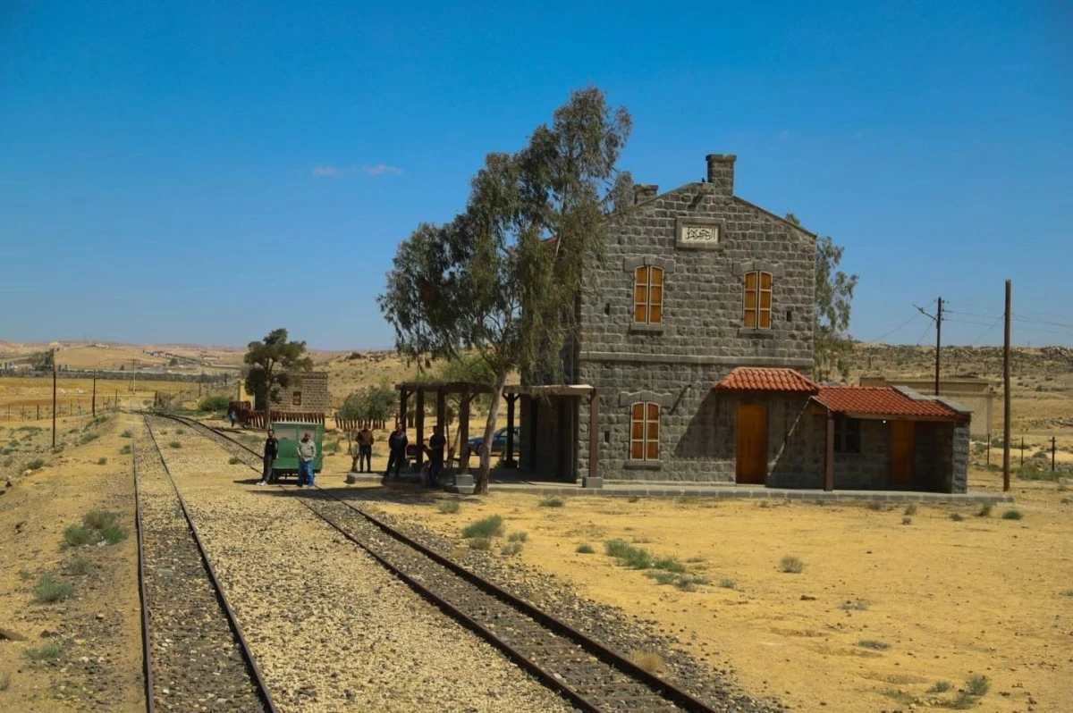
تعد سكة حديد الحجاز في محافظة المفرق واحدة من أبرز المعالم التاريخية المرتبطة بتشكل السردية الوطنية الأردنية، لما لعبته من دور محوري في التحولات السياسية والاجتماعية والاقتصادية التي شهدتها المنطقة منذ مطلع القرن العشرين، وصولا إلى مرحلة تأسيس الدولة الأردنية الحديثة.

ويرى الباحث في تاريخ وتراث المفرق ابراهيم الحراحشه، أن محطة سكة الحديد في المفرق لم تكن مجرد محطة لنقل الركاب والبضائع، بل شكلت مركزا استراتيجيا مهما ربط بين بلاد الشام والجزيرة العربية، وأسهم في تعزيز مكانة المفرق كمحور حيوي على خارطة المنطقة، الأمر الذي انعكس على نمو المدينة عمرانيا واقتصاديا واجتماعيا.

وأضاف إلى "الرأي" ، أن السكة ترتبط ارتباطا وثيقا بأحداث الثورة العربية الكبرى، إذ كانت خطا استراتيجيا خلال العمليات العسكرية والتحركات التي شهدتها المنطقة آنذاك، كما شكلت البادية الشمالية والمفرق جزءا مهما من المشهد التاريخي المرتبط بالثورة وبدايات المشروع العربي.

ويؤكد استاذ علم الاجتماع في الجامعة الهاشمية سابقا، خالد فياض، أن الحديث عن السردية الأردنية لا يكتمل دون التوقف عند الدور الذي لعبته سكة الحديد في بناء ملامح الدولة الحديثة، حيث ساهمت في تنشيط الحركة التجارية وظهور الأسواق واستقرار السكان حول المحطة، إلى جانب تعزيز التواصل بين المجتمعات المحلية ومختلف المناطق المجاورة.

كما ساعدت السكة، بحسب فياض، على خلق حالة من التفاعل الاجتماعي والثقافي بين أبناء البادية والمسافرين والتجار والحجاج، ما عزز من التنوع الاجتماعي والهوية الوطنية الجامعة التي تعد من أبرز مرتكزات السردية الأردنية المعاصرة.

ويشير إلى أن محطة سكة الحديد في المفرق ما تزال حتى اليوم تحمل قيمة رمزية ووطنية كبيرة، باعتبارها شاهدا على مراحل تاريخية مفصلية عاشها الأردن، داعين إلى الحفاظ على هذا الإرث التاريخي وإعادة إحيائه ضمن مشاريع ثقافية وسياحية تسهم في تعزيز الوعي بتاريخ الدولة الأردنية ودور محافظة المفرق في مسيرتها الوطنية.

.alrai-epaper-widget{margin-top: 20px; max-width:250px}
Tweets by alrai
.alrai-facebook-embed{margin-top: 70px;}
.container .row .col-md-12:has(.alrai-section-last-widget) { flex-direction: column; } .alrai-section-last-widget { margin: 0 auto; position: relative; padding-top: 35px; width: 100%; } #widget_2097 .alrai-section-last-widget { padding-top: 35px; margin-top: 0; } .alrai-section-last-widget::after { position: absolute; content: url("https://alrai.com/alraijordan/uploads/global_files/section-page-faded-line.svg?v=1"); top: 0; transform: translateX(0); } .alrai-section-last-widget .full-col { overflow-x: auto; overflow-y: hidden; -webkit-overflow-scrolling: touch; width: 100%; } .alrai-section-last-widget .row-element { width: 100%; } .alrai-section-last-widget .content-wrapper { display: flex; flex-direction: row; flex-wrap: nowrap; align-items: stretch; width: max-content; min-width: 100%; gap: 30px; justify-content: center; padding-top: 30px; } .alrai-section-last-widget .item-row { flex: 0 0 auto; width: 200px; margin-right: 7px; display: flex; flex-direction: column; height: 195px; } .alrai-section-last-widget .row-element .item-row .img-ratio { padding-bottom: 100%; display: flex; } .alrai-section-last-widget .row-element .item-row .img-ratio img { border-radius: 50%; border: 2px solid #00a0e5; padding: 3px; } .alrai-section-last-widget .article-title { white-space: nowrap; overflow: hidden; text-overflow: ellipsis; display: block; } .alrai-section-last-widget .item-row .item-info a { color: #000; color: color(display-p3 0 0 0); text-align: center; font-size: 14px; font-style: normal; font-weight: 800; line-height: 20px; text-decoration: none; display: -webkit-box; -webkit-line-clamp: 3; -webkit-box-orient: vertical; overflow: hidden; white-space: normal; } .alrai-section-last-widget .full-col::-webkit-scrollbar { display: none; } @media screen and (min-width: 1200px) { .alrai-section-last-widget::after { transform: translateX(0); } } @media screen and (max-width: 768px) { .alrai-section-last-widget .row-element .content-wrapper { flex-direction: row !important; } .alrai-section-last-widget::after { transform: translateX(100%); right: 0; left: 0; } }
.death-statistics-marquee .article-title a, .death-statistics-marquee .title-widget-2 a { text-align: right; font-family: Cairo; font-style: normal; font-weight: 700; line-height: 25px; text-decoration: none; } .death-statistics-marquee .breaking-news-wrapper { width: 100%; display: flex; } .death-statistics-marquee .breaking-news { background-color: #7c0000; padding: 22px 17px 24px 18px; color: #fff; text-align: right; font-family: Cairo; font-size: 22px; font-weight: 700; line-height: 25px; } .death-statistics-marquee .breaking-news-content { background-color: #b90000; padding: 22px 18px 24px 21px; color: #fff; text-align: right; font-family: Cairo; font-size: 22px; font-weight: 700; line-height: 25px; width: 100%; position: relative; } .full-container .marquee-container-widget:not(.relative-widget) .wrapper-row { position: fixed; width: 100%; right: 0; bottom: 0; z-index: 100000; } .death-statistics-marquee .marquee-container-widget .title-widget-2 { width: 75px; background-color: #757575; color: #fff; height: 60px; display: flex; align-items: center; justify-content: center; } .death-statistics-marquee .title-widget-2 a { color: #fff; color: color(display-p3 1 1 1); font-size: 15px; padding: 16px 18px 16px 15px; display: block; } .death-statistics-marquee .content-row:not(.content-row-full) { width: calc(100% - 100px); background-color: #000; } .death-statistics-marquee .content-row marquee { direction: ltr; } .death-statistics-marquee .content-row .img-item { display: inline-flex; height: 60px; align-items: center; vertical-align: top; } .death-statistics-marquee .content-row .article-title { height: 60px; display: inline-flex; align-items: center; color: #fff; padding: 0 15px; direction: rtl; } .death-statistics-marquee .article-title a { color: #fff; color: color(display-p3 1 1 1); font-size: 17px; } .death-statistics-marquee .title-widget-2 { width: 100px; } #widget_1932 { position: static; bottom: 0; width: 100%; z-index: 1; } @media scren and (max-width:768px){ .death-statistics-marquee .breaking-news-content{ font-family: 'Cairo', sans-serif; } }