"سنتكوم" توجه عشرات السفن لمسارات بديلة في إطار حصار هرمز

تاريخ النشر : الأحد 11:38 3-5-2026
No Image
الرأي - وكالات 

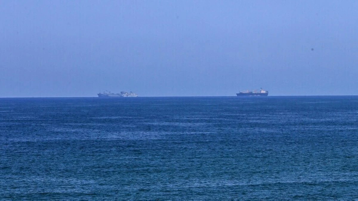
أعلنت القيادة المركزية الأمريكية (سنتكوم) توجيه ما مجموعه 49 سفينة تجارية حتى اليوم الأحد، إلى مسارات مختلفة، في إطار الحصار البحري الذي تفرضه الولايات المتحدة على إيران.

وفي بيان نشرته على حسابها بمنصة شركة إكس الأمريكية، قالت سنتكوم، إن الحصار البحري الذي تفرضه الولايات المتحدة على إيران يُطبَّق "بشكل كامل".

وأوضح البيان، أن قائد القيادة المركزية براد كوبر، أجرى زيارة لسفينة أمريكية تعمل في المنطقة.

وأضاف: "تواصل القوات الأمريكية التزامها بتنفيذ الحصار بشكل كامل".

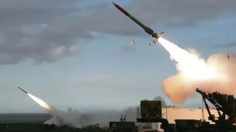
وبدأت الولايات المتحدة وإسرائيل حربا على إيران في 28 فبراير/ شباط، لترد الأخيرة بشن هجمات على إسرائيل وضد ما قالت إنها "مواقع ومصالح أمريكية" في دول المنطقة، قبل أن تعلن واشنطن وطهران في 8 أبريل/ نيسان المنصرم، هدنة مؤقتة بوساطة باكستانية.

وعقب فشل الجولة الأولى من مسار المفاوضات بين الولايات المتحدة وإيران في باكستان، أعلن الرئيس الأمريكي دونالد ترامب، في 13 أبريل الفائت، فرض حصار على مضيق هرمز المغلق منذ 2 مارس/آذار الماضي.

ومع بداية الهدنة في 8 أبريل، أعلنت طهران إعادة فتح المضيق، ولكنها لاحقا قررت غلقه، بعد أن بدأت واشنطن فرض حصار بحري على الموانئ الإيرانية.

وفي 11 أبريل، استضافت باكستان جولة محادثات بين الطرفين لم تفض إلى اتفاق، ولاحقا تم الإعلان عن تمديد الهدنة بناء على طلب إسلام آباد دون تحديد مدة.

.alrai-epaper-widget{margin-top: 20px; max-width:250px}
Tweets by alrai
.alrai-facebook-embed{margin-top: 70px;}
.container .row .col-md-12:has(.alrai-section-last-widget) { flex-direction: column; } .alrai-section-last-widget { margin: 0 auto; position: relative; padding-top: 35px; width: 100%; } #widget_2097 .alrai-section-last-widget { padding-top: 35px; margin-top: 0; } .alrai-section-last-widget::after { position: absolute; content: url("https://alrai.com/alraijordan/uploads/global_files/section-page-faded-line.svg?v=1"); top: 0; transform: translateX(0); } .alrai-section-last-widget .full-col { overflow-x: auto; overflow-y: hidden; -webkit-overflow-scrolling: touch; width: 100%; } .alrai-section-last-widget .row-element { width: 100%; } .alrai-section-last-widget .content-wrapper { display: flex; flex-direction: row; flex-wrap: nowrap; align-items: stretch; width: max-content; min-width: 100%; gap: 30px; justify-content: center; padding-top: 30px; } .alrai-section-last-widget .item-row { flex: 0 0 auto; width: 200px; margin-right: 7px; display: flex; flex-direction: column; height: 195px; } .alrai-section-last-widget .row-element .item-row .img-ratio { padding-bottom: 100%; display: flex; } .alrai-section-last-widget .row-element .item-row .img-ratio img { border-radius: 50%; border: 2px solid #00a0e5; padding: 3px; } .alrai-section-last-widget .article-title { white-space: nowrap; overflow: hidden; text-overflow: ellipsis; display: block; } .alrai-section-last-widget .item-row .item-info a { color: #000; color: color(display-p3 0 0 0); text-align: center; font-size: 14px; font-style: normal; font-weight: 800; line-height: 20px; text-decoration: none; display: -webkit-box; -webkit-line-clamp: 3; -webkit-box-orient: vertical; overflow: hidden; white-space: normal; } .alrai-section-last-widget .full-col::-webkit-scrollbar { display: none; } @media screen and (min-width: 1200px) { .alrai-section-last-widget::after { transform: translateX(0); } } @media screen and (max-width: 768px) { .alrai-section-last-widget .row-element .content-wrapper { flex-direction: row !important; } .alrai-section-last-widget::after { transform: translateX(100%); right: 0; left: 0; } }
.death-statistics-marquee .article-title a, .death-statistics-marquee .title-widget-2 a { text-align: right; font-family: Cairo; font-style: normal; font-weight: 700; line-height: 25px; text-decoration: none; } .death-statistics-marquee .breaking-news-wrapper { width: 100%; display: flex; } .death-statistics-marquee .breaking-news { background-color: #7c0000; padding: 22px 17px 24px 18px; color: #fff; text-align: right; font-family: Cairo; font-size: 22px; font-weight: 700; line-height: 25px; } .death-statistics-marquee .breaking-news-content { background-color: #b90000; padding: 22px 18px 24px 21px; color: #fff; text-align: right; font-family: Cairo; font-size: 22px; font-weight: 700; line-height: 25px; width: 100%; position: relative; } .full-container .marquee-container-widget:not(.relative-widget) .wrapper-row { position: fixed; width: 100%; right: 0; bottom: 0; z-index: 100000; } .death-statistics-marquee .marquee-container-widget .title-widget-2 { width: 75px; background-color: #757575; color: #fff; height: 60px; display: flex; align-items: center; justify-content: center; } .death-statistics-marquee .title-widget-2 a { color: #fff; color: color(display-p3 1 1 1); font-size: 15px; padding: 16px 18px 16px 15px; display: block; } .death-statistics-marquee .content-row:not(.content-row-full) { width: calc(100% - 100px); background-color: #000; } .death-statistics-marquee .content-row marquee { direction: ltr; } .death-statistics-marquee .content-row .img-item { display: inline-flex; height: 60px; align-items: center; vertical-align: top; } .death-statistics-marquee .content-row .article-title { height: 60px; display: inline-flex; align-items: center; color: #fff; padding: 0 15px; direction: rtl; } .death-statistics-marquee .article-title a { color: #fff; color: color(display-p3 1 1 1); font-size: 17px; } .death-statistics-marquee .title-widget-2 { width: 100px; } #widget_1932 { position: static; bottom: 0; width: 100%; z-index: 1; } @media scren and (max-width:768px){ .death-statistics-marquee .breaking-news-content{ font-family: 'Cairo', sans-serif; } }