زمن تاريخي للعداءة ريتشاردسون بسباق ستاويل غيفت

تاريخ النشر : الاثنين 10:34 6-4-2026
No Image

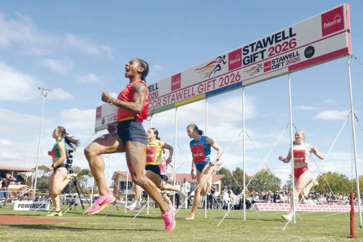
فازت نجمة سباقات السرعة الأميركية شاكاري ريتشاردسون بسباق «ستاويل غيفت» الأسترالي المرموق أمس، مسجلة أسرع زمن في تاريخه.

ويُقام السباق على أرض عشبية لمسافة 120 م بانحدار طفيف في بلدة ريفية صغيرة قرب ملبورن، حيث يتم تحديد نقاط انطلاق العدائين والعداءات بناء على أدائهم السابق.

وتمكنت ريتشاردسون، بطلة العالم السابقة في سباق 100 م والحاصلة على فضية 100 م وذهبية التتابع في أولمبياد باريس 2024، من تقليص الفارق مع متسابقات سبقنَها بفارق يصل إلى تسعة أمتار.

واجتازت ريتشاردسون خط النهاية بوقت قدره 13.15 ثانية لتصبح ثالث عداءة تفوز بالسباق من الصفر، أي من المركز الاخير.

وقالت ريتشاردسون «كان السباق رائعا»، مضيفة «لقد ركّزت (أنا ومدربي دينيس (ميتشل) على تنفيذ خطة السباق التي كنا نعمل عليها، واستخدمت هذا السباق لإظهار قدراتي الجديدة».

وأكدت أنها لم تكن تعرف ما الذي ينتظرها في سباقات العشب، لكن التجربة تبشر بموسم حافل قادم.

وأضافت العداءة البالغة 26 عاما «لا أعتبر هذا السباق أقل شأنا من أي سباق عادي، سواء كان بطولة العالم أو الألعاب الأولمبية... في كل مرة تتاح لك فرصة لمس المضمار، عليك استغلالها».

أما صديقها كريستيان كولمان، حامل الرقم القياسي العالمي لسباق 60 م داخل قاعة والذي بدأ السباق أيضا متأخرا 5.25 أمتار عن أقرب منافسيه، فلم يتمكن من تجاوز الدور نصف النهائي.

وقال «الخسارة بفارق كبير في سباق 120 م أمرٌ وارد، لكنني استمتعت».

وفاز الأسترالي أولوفيمي كومولافي بالسباق النهائي بزمن قدره 12.03 ثانية.

يُعدّ سباق «ستاويل غيفت» أقدم سباق سرعة في أستراليا، ويعود تاريخه إلى «أيام حمى الذهب» في المنطقة، وهي فترات تاريخية من القرن التاسع عشر تميزت بالهجرة الجماعية والنشاط الاقتصادي السريع في أعقاب اكتشافات الذهب.

ويُقام سنويا منذ عام 1878 باستثناء أربع سنوات خلال الحرب العالمية الثانية ومرة واحدة خلال فيروس كورونا.

.alrai-epaper-widget{margin-top: 20px; max-width:250px}
Tweets by alrai
.alrai-facebook-embed{margin-top: 70px;}
.container .row .col-md-12:has(.alrai-section-last-widget) { flex-direction: column; } .alrai-section-last-widget { margin: 0 auto; position: relative; padding-top: 35px; width: 100%; } #widget_2097 .alrai-section-last-widget { padding-top: 35px; margin-top: 0; } .alrai-section-last-widget::after { position: absolute; content: url("https://alrai.com/alraijordan/uploads/global_files/section-page-faded-line.svg?v=1"); top: 0; transform: translateX(0); } .alrai-section-last-widget .full-col { overflow-x: auto; overflow-y: hidden; -webkit-overflow-scrolling: touch; width: 100%; } .alrai-section-last-widget .row-element { width: 100%; } .alrai-section-last-widget .content-wrapper { display: flex; flex-direction: row; flex-wrap: nowrap; align-items: stretch; width: max-content; min-width: 100%; gap: 30px; justify-content: center; padding-top: 30px; } .alrai-section-last-widget .item-row { flex: 0 0 auto; width: 200px; margin-right: 7px; display: flex; flex-direction: column; height: 195px; } .alrai-section-last-widget .row-element .item-row .img-ratio { padding-bottom: 100%; display: flex; } .alrai-section-last-widget .row-element .item-row .img-ratio img { border-radius: 50%; border: 2px solid #00a0e5; padding: 3px; } .alrai-section-last-widget .article-title { white-space: nowrap; overflow: hidden; text-overflow: ellipsis; display: block; } .alrai-section-last-widget .item-row .item-info a { color: #000; color: color(display-p3 0 0 0); text-align: center; font-size: 14px; font-style: normal; font-weight: 800; line-height: 20px; text-decoration: none; display: -webkit-box; -webkit-line-clamp: 3; -webkit-box-orient: vertical; overflow: hidden; white-space: normal; } .alrai-section-last-widget .full-col::-webkit-scrollbar { display: none; } @media screen and (min-width: 1200px) { .alrai-section-last-widget::after { transform: translateX(0); } } @media screen and (max-width: 768px) { .alrai-section-last-widget .row-element .content-wrapper { flex-direction: row !important; } .alrai-section-last-widget::after { transform: translateX(100%); right: 0; left: 0; } }
.death-statistics-marquee .article-title a, .death-statistics-marquee .title-widget-2 a { text-align: right; font-family: Cairo; font-style: normal; font-weight: 700; line-height: 25px; text-decoration: none; } .death-statistics-marquee .breaking-news-wrapper { width: 100%; display: flex; } .death-statistics-marquee .breaking-news { background-color: #7c0000; padding: 22px 17px 24px 18px; color: #fff; text-align: right; font-family: Cairo; font-size: 22px; font-weight: 700; line-height: 25px; } .death-statistics-marquee .breaking-news-content { background-color: #b90000; padding: 22px 18px 24px 21px; color: #fff; text-align: right; font-family: Cairo; font-size: 22px; font-weight: 700; line-height: 25px; width: 100%; position: relative; } .full-container .marquee-container-widget:not(.relative-widget) .wrapper-row { position: fixed; width: 100%; right: 0; bottom: 0; z-index: 100000; } .death-statistics-marquee .marquee-container-widget .title-widget-2 { width: 75px; background-color: #757575; color: #fff; height: 60px; display: flex; align-items: center; justify-content: center; } .death-statistics-marquee .title-widget-2 a { color: #fff; color: color(display-p3 1 1 1); font-size: 15px; padding: 16px 18px 16px 15px; display: block; } .death-statistics-marquee .content-row:not(.content-row-full) { width: calc(100% - 100px); background-color: #000; } .death-statistics-marquee .content-row marquee { direction: ltr; } .death-statistics-marquee .content-row .img-item { display: inline-flex; height: 60px; align-items: center; vertical-align: top; } .death-statistics-marquee .content-row .article-title { height: 60px; display: inline-flex; align-items: center; color: #fff; padding: 0 15px; direction: rtl; } .death-statistics-marquee .article-title a { color: #fff; color: color(display-p3 1 1 1); font-size: 17px; } .death-statistics-marquee .title-widget-2 { width: 100px; } #widget_1932 { position: static; bottom: 0; width: 100%; z-index: 1; } @media scren and (max-width:768px){ .death-statistics-marquee .breaking-news-content{ font-family: 'Cairo', sans-serif; } }