"أوقاف الكرك" ""تعقد المجلس العلمي الهاشمي الثاني

تاريخ النشر : الأربعاء 12:26 4-3-2026
No Image
الكرك  -  نسرين الضمور

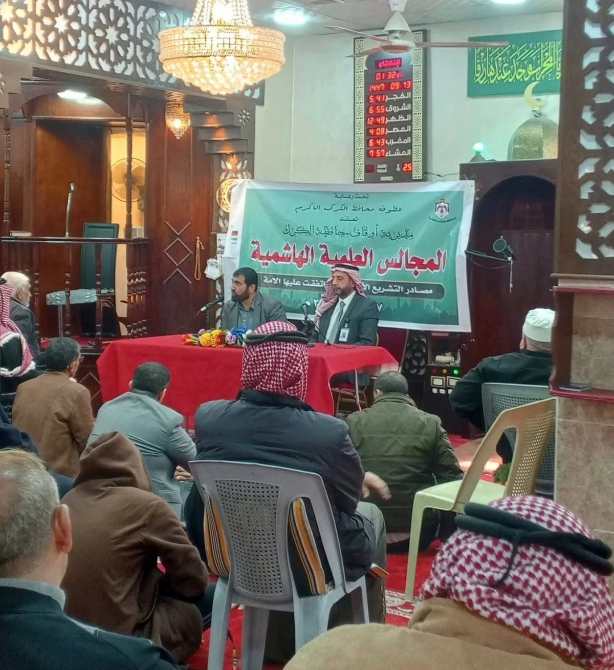
عقدت مديرية أوقاف محافظة الكرك في مسجد المرج الكبير بضاحية المرج ،المجلس العلمي الهاشمي الثاني بعنوان " السنة النبوية ثاني المصادر فيها البيان والتبين في اطار ،وذلك بحضور مساعد محافظ الكرك أمجد بن طريف وجمع من الائمة والمصلين .

وقال مدير أوقاف الكرك سنان المجالي ان اقامة المجالس العلميه الهاشمية التي تاخذ بدور المسجد كاساس لبناء الفرد والمجتمع ويتم عقدها في شهر رمضان من كل عام كسنة مباركة ،دليل على حرص جلالة الملك عبد الله الثاني لتشمل جميع مساجد المملكة وملتقياتها للارتقاء بالعلم والعلماء وتعظيم العلم الشرعي .

وبين المجالي ان السنة النبوية هي المصدر التشريعي الثاني من مصادر التشريع الأربعة التي اتفقت عليها الأمة،وتتمثل في اقوال وافعال واقرارات النبي محمد صلى الله عليه وسلم وهي مرتبطة بالقران الكريم المرجع الاول في فهم الدين ،عقيدة وعبادة .

وتحدث الامام والخطيب في مديرية الاوقاف الدكتور نواف البطوش عن حجية السنة ودورها في بيان أحكام القرآن الكريم، وترسيخ الفهم الصحيح للدين ،مشيرا إلى أقسام السنة باعتبار الإسناد ودلالة الأحاديث القطعية والظنية ثبوتا ودلالة .

واوضح أن السنة النبوية ركزت على القضايا الكلية والفرعية في الشريعة الإسلامية بعد كتاب الله ، ولا يجوز الاستغناء عنها وهي واجبة الاتباع وتقوم بتفصيل المجمل وتخصيص العام وتقييد المطلق في القران الكريم.

.alrai-epaper-widget{margin-top: 20px; max-width:250px}
Tweets by alrai
.alrai-facebook-embed{margin-top: 70px;}
.container .row .col-md-12:has(.alrai-section-last-widget) { flex-direction: column; } .alrai-section-last-widget { margin: 0 auto; position: relative; padding-top: 35px; width: 100%; } #widget_2097 .alrai-section-last-widget { padding-top: 35px; margin-top: 0; } .alrai-section-last-widget::after { position: absolute; content: url("https://alrai.com/alraijordan/uploads/global_files/section-page-faded-line.svg?v=1"); top: 0; transform: translateX(0); } .alrai-section-last-widget .full-col { overflow-x: auto; overflow-y: hidden; -webkit-overflow-scrolling: touch; width: 100%; } .alrai-section-last-widget .row-element { width: 100%; } .alrai-section-last-widget .content-wrapper { display: flex; flex-direction: row; flex-wrap: nowrap; align-items: stretch; width: max-content; min-width: 100%; gap: 30px; justify-content: center; padding-top: 30px; } .alrai-section-last-widget .item-row { flex: 0 0 auto; width: 200px; margin-right: 7px; display: flex; flex-direction: column; height: 195px; } .alrai-section-last-widget .row-element .item-row .img-ratio { padding-bottom: 100%; display: flex; } .alrai-section-last-widget .row-element .item-row .img-ratio img { border-radius: 50%; border: 2px solid #00a0e5; padding: 3px; } .alrai-section-last-widget .article-title { white-space: nowrap; overflow: hidden; text-overflow: ellipsis; display: block; } .alrai-section-last-widget .item-row .item-info a { color: #000; color: color(display-p3 0 0 0); text-align: center; font-size: 14px; font-style: normal; font-weight: 800; line-height: 20px; text-decoration: none; display: -webkit-box; -webkit-line-clamp: 3; -webkit-box-orient: vertical; overflow: hidden; white-space: normal; } .alrai-section-last-widget .full-col::-webkit-scrollbar { display: none; } @media screen and (min-width: 1200px) { .alrai-section-last-widget::after { transform: translateX(0); } } @media screen and (max-width: 768px) { .alrai-section-last-widget .row-element .content-wrapper { flex-direction: row !important; } .alrai-section-last-widget::after { transform: translateX(100%); right: 0; left: 0; } }
.death-statistics-marquee .article-title a, .death-statistics-marquee .title-widget-2 a { text-align: right; font-family: Cairo; font-style: normal; font-weight: 700; line-height: 25px; text-decoration: none; } .death-statistics-marquee .breaking-news-wrapper { width: 100%; display: flex; } .death-statistics-marquee .breaking-news { background-color: #7c0000; padding: 22px 17px 24px 18px; color: #fff; text-align: right; font-family: Cairo; font-size: 22px; font-weight: 700; line-height: 25px; } .death-statistics-marquee .breaking-news-content { background-color: #b90000; padding: 22px 18px 24px 21px; color: #fff; text-align: right; font-family: Cairo; font-size: 22px; font-weight: 700; line-height: 25px; width: 100%; position: relative; } .full-container .marquee-container-widget:not(.relative-widget) .wrapper-row { position: fixed; width: 100%; right: 0; bottom: 0; z-index: 100000; } .death-statistics-marquee .marquee-container-widget .title-widget-2 { width: 75px; background-color: #757575; color: #fff; height: 60px; display: flex; align-items: center; justify-content: center; } .death-statistics-marquee .title-widget-2 a { color: #fff; color: color(display-p3 1 1 1); font-size: 15px; padding: 16px 18px 16px 15px; display: block; } .death-statistics-marquee .content-row:not(.content-row-full) { width: calc(100% - 100px); background-color: #000; } .death-statistics-marquee .content-row marquee { direction: ltr; } .death-statistics-marquee .content-row .img-item { display: inline-flex; height: 60px; align-items: center; vertical-align: top; } .death-statistics-marquee .content-row .article-title { height: 60px; display: inline-flex; align-items: center; color: #fff; padding: 0 15px; direction: rtl; } .death-statistics-marquee .article-title a { color: #fff; color: color(display-p3 1 1 1); font-size: 17px; } .death-statistics-marquee .title-widget-2 { width: 100px; } #widget_1932 { position: static; bottom: 0; width: 100%; z-index: 1; } @media scren and (max-width:768px){ .death-statistics-marquee .breaking-news-content{ font-family: 'Cairo', sans-serif; } }