مفاجآت لافته.. شركات التأمين بين الشكاوى والتسويات

تاريخ النشر : الاثنين 10:17 15-12-2025
No Image
  عمان - الرأي

شكلت التسويات قرابة 13% من إجمالي الشكاوى التي تقدم بها عملاء شركات التأمين، في 10 شهور من العام الحالي، إذ تقدموا بــ 5331 شكوى، تمت تسوية 684 شكوى منها.

ونما إجمالي أقساط التأمين في 10 شهور من العام الحالي، بنسبة وصلت إلى 10%، أو ما يعادل 68 مليون دينار، لتبلغ 732 مليون دينار، مقابل 664 مليون دينار، في الفترة ذاتها من 2024، وفق أحدث بيانات البنك المركزي.

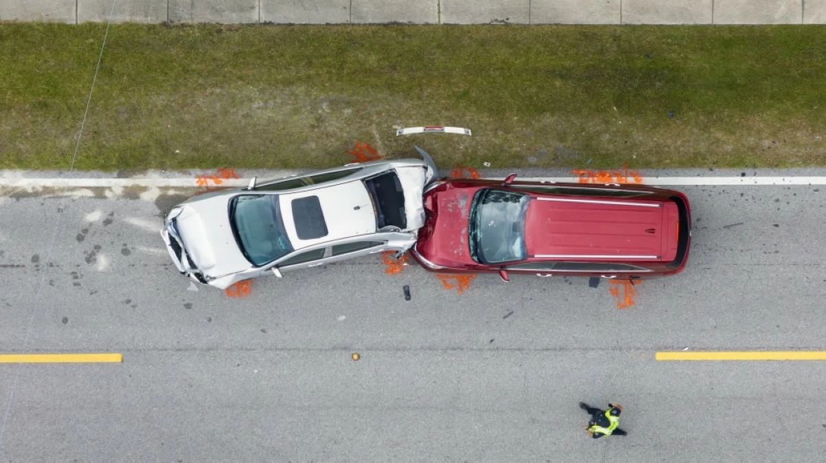
واختلف ترتيب التأمين الذي يستحوذ على النصيب الأكبر من الأقساط التي يدفعها المواطنون للشركات، واحتل "المركبات" المرتبة الأولى بقيمة قاربت 249 مليون دينار، متفوقا على التأمين الطبي الذي بقي في المرتبة الأولى من حجم الأقساط منذ مطلع العام، إلا أنه تراجع للمرتبة الثانية في نهاية تشرين أول الماضي، وبقيمة 238 مليون دينار تقريبا.

من ناحية أخرى، ارتفع إجمالي قيمة التعويضات التي دفعتها شركات التأمين، في 10 شهور من العام الحالي، بنحو 19 مليون دينار، ووصلت بالتالي إلى 458 مليون دينار، مقارنة بالفترة من كانون الثاني إلى نهاية تشرين أول من 2024، إذ بلغت في ذلك الوقت قرابة 340 مليون دينار.

واستمر قطاع تأمين المركبات بسيطرته على الحصة الكبرى من التعويضات المدفوعة بنهاية تشرين أول من العام الحالي، بنحو 50%، ووصلت قيمة هذه التعويضات إلى 229 مليون دينار تقريبا، ليأتي التأمين الطبي، ثانيا في القائمة، بــ 169 مليون دينار، وبنحو 37%، من إجمالي هذه التعويضات.

.alrai-epaper-widget{margin-top: 20px; max-width:250px}
Tweets by alrai
.alrai-facebook-embed{margin-top: 70px;}
.container .row .col-md-12:has(.alrai-section-last-widget) { flex-direction: column; } .alrai-section-last-widget { margin: 0 auto; position: relative; padding-top: 35px; width: 100%; } #widget_2097 .alrai-section-last-widget { padding-top: 35px; margin-top: 0; } .alrai-section-last-widget::after { position: absolute; content: url("https://alrai.com/alraijordan/uploads/global_files/section-page-faded-line.svg?v=1"); top: 0; transform: translateX(0); } .alrai-section-last-widget .full-col { overflow-x: auto; overflow-y: hidden; -webkit-overflow-scrolling: touch; width: 100%; } .alrai-section-last-widget .row-element { width: 100%; } .alrai-section-last-widget .content-wrapper { display: flex; flex-direction: row; flex-wrap: nowrap; align-items: stretch; width: max-content; min-width: 100%; gap: 30px; justify-content: center; padding-top: 30px; } .alrai-section-last-widget .item-row { flex: 0 0 auto; width: 200px; margin-right: 7px; display: flex; flex-direction: column; height: 195px; } .alrai-section-last-widget .row-element .item-row .img-ratio { padding-bottom: 100%; display: flex; } .alrai-section-last-widget .row-element .item-row .img-ratio img { border-radius: 50%; border: 2px solid #00a0e5; padding: 3px; } .alrai-section-last-widget .article-title { white-space: nowrap; overflow: hidden; text-overflow: ellipsis; display: block; } .alrai-section-last-widget .item-row .item-info a { color: #000; color: color(display-p3 0 0 0); text-align: center; font-size: 14px; font-style: normal; font-weight: 800; line-height: 20px; text-decoration: none; display: -webkit-box; -webkit-line-clamp: 3; -webkit-box-orient: vertical; overflow: hidden; white-space: normal; } .alrai-section-last-widget .full-col::-webkit-scrollbar { display: none; } @media screen and (min-width: 1200px) { .alrai-section-last-widget::after { transform: translateX(0); } } @media screen and (max-width: 768px) { .alrai-section-last-widget .row-element .content-wrapper { flex-direction: row !important; } .alrai-section-last-widget::after { transform: translateX(100%); right: 0; left: 0; } }
.death-statistics-marquee .article-title a, .death-statistics-marquee .title-widget-2 a { text-align: right; font-family: Cairo; font-style: normal; font-weight: 700; line-height: 25px; text-decoration: none; } .death-statistics-marquee .breaking-news-wrapper { width: 100%; display: flex; } .death-statistics-marquee .breaking-news { background-color: #7c0000; padding: 22px 17px 24px 18px; color: #fff; text-align: right; font-family: Cairo; font-size: 22px; font-weight: 700; line-height: 25px; } .death-statistics-marquee .breaking-news-content { background-color: #b90000; padding: 22px 18px 24px 21px; color: #fff; text-align: right; font-family: Cairo; font-size: 22px; font-weight: 700; line-height: 25px; width: 100%; position: relative; } .full-container .marquee-container-widget:not(.relative-widget) .wrapper-row { position: fixed; width: 100%; right: 0; bottom: 0; z-index: 100000; } .death-statistics-marquee .marquee-container-widget .title-widget-2 { width: 75px; background-color: #757575; color: #fff; height: 60px; display: flex; align-items: center; justify-content: center; } .death-statistics-marquee .title-widget-2 a { color: #fff; color: color(display-p3 1 1 1); font-size: 15px; padding: 16px 18px 16px 15px; display: block; } .death-statistics-marquee .content-row:not(.content-row-full) { width: calc(100% - 100px); background-color: #000; } .death-statistics-marquee .content-row marquee { direction: ltr; } .death-statistics-marquee .content-row .img-item { display: inline-flex; height: 60px; align-items: center; vertical-align: top; } .death-statistics-marquee .content-row .article-title { height: 60px; display: inline-flex; align-items: center; color: #fff; padding: 0 15px; direction: rtl; } .death-statistics-marquee .article-title a { color: #fff; color: color(display-p3 1 1 1); font-size: 17px; } .death-statistics-marquee .title-widget-2 { width: 100px; } #widget_1932 { position: static; bottom: 0; width: 100%; z-index: 1; } @media scren and (max-width:768px){ .death-statistics-marquee .breaking-news-content{ font-family: 'Cairo', sans-serif; } }