العزام: وفر بقيمة 50% من خلال خصومات المسقفات

تاريخ النشر : السبت 12:37 8-11-2025
No Image

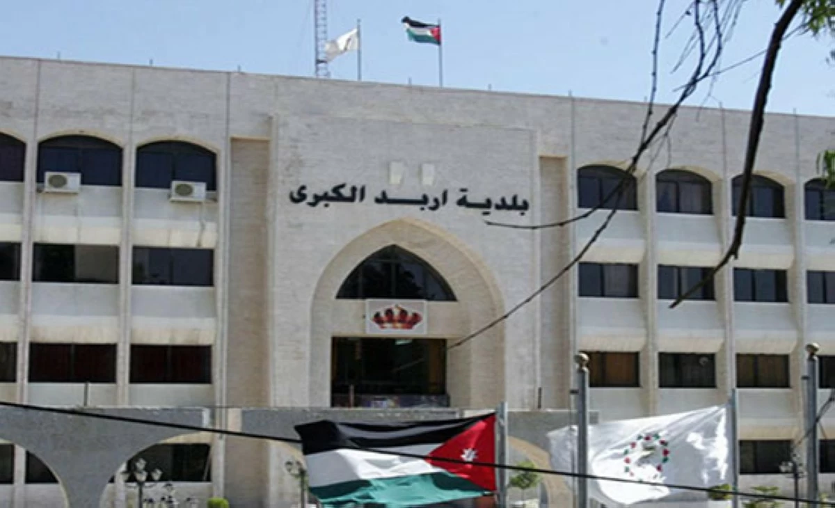
اكد رئيس لجنة بلدية اربد الكبرى عماد العزام ان البلدية باشرت بتنفيذ قرار رئاسة الوزراء القاضي بمنح خصم تشجيعي بنسبة 20% على ضريبة الأبنية والأراضي (المسقفات) وضريبة المعارف، ورسوم الصرف الصحي وذلك للمكلفين الذين يبادرون إلى تسديد مستحقاتهم قبل نهاية العام الحالي فور صدوره، وأن كوادر البلدية جاهزة لاستقبال المراجعين وتقديم الدعم اللازم لضمان استفادتهم من الإعفاءات والخصومات المعلنة.

وأشار العزام ان هذا القرار في إطار التسهيل على المواطنين والتخفيف من الأعباء المالية، وتشجيعهم على تسديد التزاماتهم للاستفادة من الإعفاءات والخصومات الممنوحة و التسهيل على المواطنين وتشجيعهم على تسديد المبالغ المترتبة عليهم، مبينًا أن البلدية .

ودعا العزام للاستفادة من قرار مجلس الوزراء باعفاء الغرامات كاملة ومنح خصم 20% وفي حال تسديد كامل ضريبة الأبنية والأراضي والرسوم المستحقة على المكلف قبل نهاية عام 2025/12/31 ويمكن ايضا التسديد النقدي أو من خلال الدفع الإلكتروني ​أي - فواتيركم ​من خلال الدخول على خيار حكومي ​وزارة الإدارة المحلية ​ضريبة الأبنية والأراضي كاملة

​إدخال الرقم الإلكتروني.

وأشار العزام ان المواطن يمكن ان يحصل على وفر بقيمة 50% من خلال الخصومات التي اقرها مجلس الوزراء ودعا المواطنين إلى مراجعة مديرية ضريبة الأبنية ومناطق البلدية او الدفع الإلكتروني للاستفادة من هذا الخصم التشجيعي.

.alrai-epaper-widget{margin-top: 20px; max-width:250px}
Tweets by alrai
.alrai-facebook-embed{margin-top: 70px;}
.container .row .col-md-12:has(.alrai-section-last-widget) { flex-direction: column; } .alrai-section-last-widget { margin: 0 auto; position: relative; padding-top: 35px; width: 100%; } #widget_2097 .alrai-section-last-widget { padding-top: 35px; margin-top: 0; } .alrai-section-last-widget::after { position: absolute; content: url("https://alrai.com/alraijordan/uploads/global_files/section-page-faded-line.svg?v=1"); top: 0; transform: translateX(0); } .alrai-section-last-widget .full-col { overflow-x: auto; overflow-y: hidden; -webkit-overflow-scrolling: touch; width: 100%; } .alrai-section-last-widget .row-element { width: 100%; } .alrai-section-last-widget .content-wrapper { display: flex; flex-direction: row; flex-wrap: nowrap; align-items: stretch; width: max-content; min-width: 100%; gap: 30px; justify-content: center; padding-top: 30px; } .alrai-section-last-widget .item-row { flex: 0 0 auto; width: 200px; margin-right: 7px; display: flex; flex-direction: column; height: 195px; } .alrai-section-last-widget .row-element .item-row .img-ratio { padding-bottom: 100%; display: flex; } .alrai-section-last-widget .row-element .item-row .img-ratio img { border-radius: 50%; border: 2px solid #00a0e5; padding: 3px; } .alrai-section-last-widget .article-title { white-space: nowrap; overflow: hidden; text-overflow: ellipsis; display: block; } .alrai-section-last-widget .item-row .item-info a { color: #000; color: color(display-p3 0 0 0); text-align: center; font-size: 14px; font-style: normal; font-weight: 800; line-height: 20px; text-decoration: none; display: -webkit-box; -webkit-line-clamp: 3; -webkit-box-orient: vertical; overflow: hidden; white-space: normal; } .alrai-section-last-widget .full-col::-webkit-scrollbar { display: none; } @media screen and (min-width: 1200px) { .alrai-section-last-widget::after { transform: translateX(0); } } @media screen and (max-width: 768px) { .alrai-section-last-widget .row-element .content-wrapper { flex-direction: row !important; } .alrai-section-last-widget::after { transform: translateX(100%); right: 0; left: 0; } }
.death-statistics-marquee .article-title a, .death-statistics-marquee .title-widget-2 a { text-align: right; font-family: Cairo; font-style: normal; font-weight: 700; line-height: 25px; text-decoration: none; } .death-statistics-marquee .breaking-news-wrapper { width: 100%; display: flex; } .death-statistics-marquee .breaking-news { background-color: #7c0000; padding: 22px 17px 24px 18px; color: #fff; text-align: right; font-family: Cairo; font-size: 22px; font-weight: 700; line-height: 25px; } .death-statistics-marquee .breaking-news-content { background-color: #b90000; padding: 22px 18px 24px 21px; color: #fff; text-align: right; font-family: Cairo; font-size: 22px; font-weight: 700; line-height: 25px; width: 100%; position: relative; } .full-container .marquee-container-widget:not(.relative-widget) .wrapper-row { position: fixed; width: 100%; right: 0; bottom: 0; z-index: 100000; } .death-statistics-marquee .marquee-container-widget .title-widget-2 { width: 75px; background-color: #757575; color: #fff; height: 60px; display: flex; align-items: center; justify-content: center; } .death-statistics-marquee .title-widget-2 a { color: #fff; color: color(display-p3 1 1 1); font-size: 15px; padding: 16px 18px 16px 15px; display: block; } .death-statistics-marquee .content-row:not(.content-row-full) { width: calc(100% - 100px); background-color: #000; } .death-statistics-marquee .content-row marquee { direction: ltr; } .death-statistics-marquee .content-row .img-item { display: inline-flex; height: 60px; align-items: center; vertical-align: top; } .death-statistics-marquee .content-row .article-title { height: 60px; display: inline-flex; align-items: center; color: #fff; padding: 0 15px; direction: rtl; } .death-statistics-marquee .article-title a { color: #fff; color: color(display-p3 1 1 1); font-size: 17px; } .death-statistics-marquee .title-widget-2 { width: 100px; } #widget_1932 { position: static; bottom: 0; width: 100%; z-index: 1; } @media scren and (max-width:768px){ .death-statistics-marquee .breaking-news-content{ font-family: 'Cairo', sans-serif; } }