#Alrai_LB_01_HomePage_full_ad { width: 728px; height: 90px; background: color(display-p3 0.9333 0.9333 0.9333); margin:0 auto; @media screen and (max-width:768px){ #Alrai_LB_01_HomePage_full_ad{ display: none } } }

الولايات المتحدة والصين تتفقان على خفض الرسوم الجمركية 

تاريخ النشر : الاثنين 10:35 12-5-2025
No Image

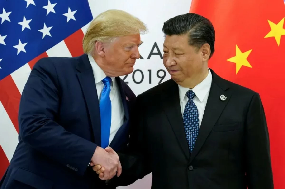
أعلنت الولايات المتحدة والصين اليوم الاثنين اتفاقا لخفض كبير في الرسوم الجمركية المتبادلة لمدة 90 يوما ما ينزع فتيل حرب تجارية هزت أسواق المال وأثارت مخاوف من حدوث تباطؤ اقتصادي عالمي.
وأوضحت القوتان الاقتصاديتان الأكبر في العالم في بيان بعد مفاوضات استمرت يومين في جنيف، أن خفض الرسوم سيدخل حيز التنفيذ "بحلول 14 أيار/مايو".
عمليا، اتفق الجانبان على خفض كبير للرسوم الجمركية الإضافية التي فرضاها على بعضهما البعض، لتتراجع الرسوم الأميركية إلى 30% والصينية إلى 10%.
وكان الرئيس الأميركي دونالد ترامب قد فرض الشهر الماضي رسوما بنسبة 145% على السلع الواردة من الصين التي ردت بفرض تعرفات بنسبة 125% على السلع الأميركية.
وانعكس الاتفاق سريعا على أسواق المال، اذ حققت مؤشرات بورصة وول ستريت ارتفاعا عند بدء التداولات، بينما أنهت أسهم الأسواق الأوروبية والآسيوية اليوم بتحقيق مكاسب.
وقال ترامب للصحافيين اليوم: "حققنا إعادة ضبط كاملة للعلاقات مع الصين عقب مناقشات مثمرة في جنيف، واتفق الطرفان على خفض الرسوم الجمركية المفروضة منذ 2 نيسان/أبريل إلى 10% لمدة 90 يوما، وستستمر المفاوضات بشأن جوانب هيكلية أوسع".
وجراء الاتفاق سيبلغ إجمالي الرسوم الجمركية التي تفرضها الولايات المتحدة على الواردات الصينية 30% لأن واشنطن لم تلغ رسوما إضافية بنسبة 20% فرضتها قبل نيسان/أبريل.
وهذه أول إشارات ملموسة على تراجع حدة الحرب التجارية التي هزت الأسواق المالية وأثارت مخاوف من أن تؤدي الرسوم الجمركية إلى تفاقم التضخم والتسبب في تباطؤ اقتصادي عالمي.

.alrai-related-topic { width: 100%; } .alrai-related-topic .wrapper-row { gap: 27px; flex-wrap: nowrap } .alrai-related-topic .item-row { padding-right: 1px; width: 280px; } .alrai-related-topic .item-row .item-info { padding: 15px 15px 28px 16px; border: 1px solid rgba(211, 211, 211, 1); height: 118px; } .alrai-related-topic .item-row .item-info a { color: #000; color: color(display-p3 0 0 0); text-align: right; font-family: Almarai; font-size: 15px; font-style: normal; font-weight: 800; line-height: 25px; text-decoration: none; -webkit-line-clamp: 3; -webkit-box-orient: vertical; display: -webkit-box; overflow: hidden; } @media screen and (max-width:768px) { .alrai-related-topic .wrapper-row { flex-wrap: wrap } .container .row .col-md-9:has(.alrai-related-topic) { width: 100%; } .alrai-related-topic { margin-top: 10px; } .alrai-related-topic .item-row { width: 100%; } }
#Alrai_LB_01_HomePage_2 { width: 300px; height: 250px; background: color(display-p3 0.9333 0.9333 0.9333); margin:23px auto; } #widget_1895 #Alrai_MPU_01{ margin-top:42px;}
.alrai-culture-art-widget {border-right: 1px solid rgba(217, 217, 217, 1);padding-right:11px;} .alrai-culture-art-widget .title-widget-1 a{color: color(display-p3 0 0.6157 0.8745);text-align: right;font-family: 'Almarai';font-size: 24px;font-style: normal;font-weight: 800;line-height: 39px;text-decoration: none;padding-bottom: 5px;} .alrai-culture-art-widget .title-widget-1{margin-bottom: 26px;} .alrai-culture-art-widget .title-widget-1::after{content: "";position: absolute;left: 0;right: 0;bottom: 0;background: linear-gradient(90deg, rgba(0, 85, 121, 0.05) 0%, rgba(0, 157, 223, 1) 100%);z-index: 1;height: 3px;width: 100%;} .alrai-culture-art-widget .img-row{width: 100%;} .alrai-culture-art-widget .img-ratio{padding-bottom: 58%;} .alrai-culture-art-widget .item-info {padding: 23px 0} .alrai-culture-art-widget .item-info a{color: #000; color: color(display-p3 0 0 0); text-align: right; text-decoration: none;} .alrai-culture-art-widget .item-row:not(:first-child) > a{display: none;} .alrai-culture-art-widget .item-row a{color: #000;color: color(display-p3 0 0 0);text-align: right;text-decoration: none;-webkit-line-clamp: 3; -webkit-box-orient: vertical; display: -webkit-box; overflow: hidden;} .alrai-culture-art-widget .item-row:not(:last-child){border-bottom: 1px solid rgba(217, 217, 217, 1);} @media screen and (min-width:1200px){ #widget_1703 .alrai-culture-art-widget{border-right:0px;padding-right:0;} }
.alrai-epaper-widget{margin-top: 20px; max-width:250px}
Tweets by alrai
.alrai-facebook-embed{margin-top: 70px;}
#Alrai_LB_01_HomePage_2 { width: 300px; height: 250px; background: color(display-p3 0.9333 0.9333 0.9333); margin:23px auto; } #widget_1895 #Alrai_MPU_01{ margin-top:42px;}
#widget_2097 .alrai-section-last-widget {padding-top:35px;margin-top:0;} .alrai-section-last-widget .row-element .item-row .img-ratio{ display:flex; } /* Horizontal scroll container */ .alrai-section-last-widget .full-col { overflow-x: auto; overflow-y: hidden; -webkit-overflow-scrolling: touch; width: 100%; } /* Flex container - critical changes */ .alrai-section-last-widget .content-wrapper { display: flex; flex-direction: row; flex-wrap: nowrap; /* Prevent wrapping to new line */ align-items: stretch; width: max-content; /* Allow container to expand */ min-width: 100%; } /* Flex items */ .alrai-section-last-widget .item-row { flex: 0 0 auto; width: 200px; /* Fixed width or use min-width */ margin-right: 7px; display: flex; /* Maintain your flex structure */ flex-direction: column; } /* Text handling */ .alrai-section-last-widget .article-title { white-space: nowrap; /* Prevent text wrapping */ overflow: hidden; text-overflow: ellipsis; display: block; } /* Multi-line text truncation */ .alrai-section-last-widget .item-row .item-info a { display: -webkit-box; -webkit-line-clamp: 3; -webkit-box-orient: vertical; overflow: hidden; white-space: normal; /* Allows line breaks for truncation */ } /* Hide scrollbar */ .alrai-section-last-widget .full-col::-webkit-scrollbar { display: none; } @media screen and (min-width:1200px){ .alrai-section-last-widget::after { transform: translateX(0); } } @media screen and (max-width: 768px) { .alrai-section-last-widget .row-element .content-wrapper { flex-direction: row !important; } .alrai-section-last-widget::after{ transform: translateX(100%); right:0; left:0; } }
.death-statistics-marquee .breaking-news-wrapper {width: 100%;display: flex;} .death-statistics-marquee .breaking-news {background-color: #7C0000;padding: 22px 17px 24px 18px;color: #FFF;text-align: right;font-family: 'Almarai';font-size: 22px;font-weight: 700;line-height: 25px;} .death-statistics-marquee .breaking-news-content {background-color: #B90000;padding: 22px 18px 24px 21px;color: #FFF;text-align: right;font-family: 'Almarai';font-size: 22px;font-weight: 700;line-height: 25px;width: 100%;position: relative;} .full-container .marquee-container-widget:not(.relative-widget) .wrapper-row {position: fixed;width: 100%;right: 0px;bottom: 0px;z-index: 100000;} .death-statistics-marquee .marquee-container-widget .title-widget-2 {width: 75px;background-color: #757575;color: #fff;height: 60px;display: flex;align-items: center;justify-content: center;} .death-statistics-marquee .title-widget-2 a {color: #FFF;color: color(display-p3 1 1 1);text-align: right;font-family: 'Almarai';font-size: 15px;font-style: normal;font-weight: 700;line-height: 25px;padding: 16px 18px 16px 15px;text-decoration: none;display:block} .death-statistics-marquee .content-row:not(.content-row-full) {width: calc(100% - 100px);background-color: #000;} .death-statistics-marquee .content-row marquee {direction: ltr;} .death-statistics-marquee .content-row .img-item {display: inline-flex;height: 60px;align-items: center;vertical-align: top;} .death-statistics-marquee .content-row .article-title {height: 60px;display: inline-flex;align-items: center;color: #fff;padding: 0px 15px;direction: rtl;} .death-statistics-marquee .article-title a {color: #FFF;color: color(display-p3 1 1 1);text-align: right;font-family: Almarai;font-size: 17px;font-style: normal;font-weight: 700;line-height: 25px;text-decoration: none;} .death-statistics-marquee .title-widget-2 {width:100px} #widget_1932{position:static;bottom:0;width:100%;z-index:1}