#Alrai_LB_01_HomePage_full_ad { width: 728px; height: 90px; background: color(display-p3 0.9333 0.9333 0.9333); margin:0 auto; @media screen and (max-width:768px){ #Alrai_LB_01_HomePage_full_ad{ display: none } } }

"أونروا": كل طفل وعجوز وامرأة بقطاع غزة يعرفون دور الهيئة الخيرية الأردنية الهاشمية

تاريخ النشر : السبت 11:34 10-5-2025
No Image

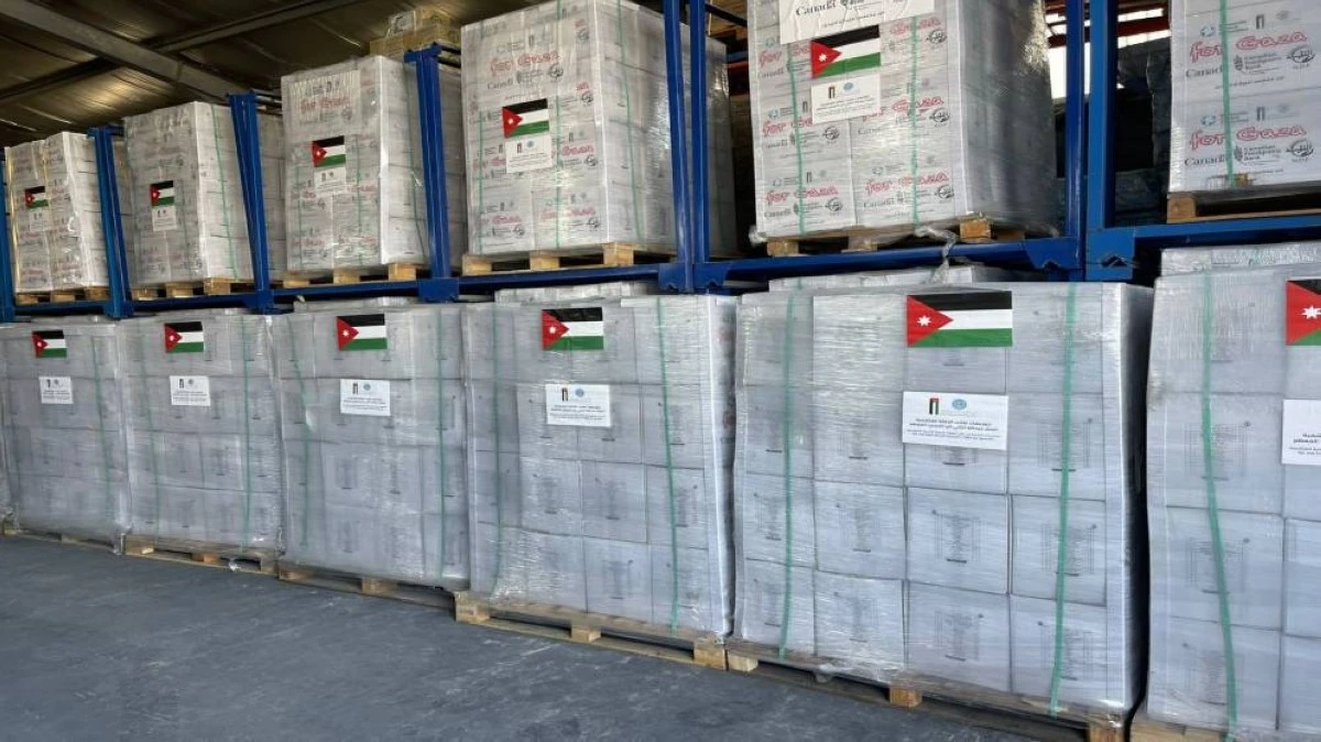
قال المستشار الإعلامي لوكالة غوث وتشغيل اللاجئين الفلسطينيين (الأونروا)، عدنان أبو حسنة، السبت، إن كل طفل وعجوز وشيخ وامرأة في قطاع غزة يعرفون دور الهيئة الخيرية الأردنية الهاشمية في إسناد الفلسطينيين.

وقال في حديثه لقناة "المملكة": " نحن في أونروا لا نكذب" ودور الأردن ودعمه للفلسطينيين تاريخي.

وأعربت الهيئة الخيرية الأردنية الهاشمية الخميس عن استغرابها ورفضها بقيام موقع يُدار من لندن بنشر مواد مضللة تحمل الأكاذيب والافتراءات على الجهد الأردني الإنساني والإغاثي المبذول منذ أواخر العام 2023 لدعم الأهل في قطاع غزة.

ولفت إلى أن الأردن عام 2009 أرسل المساعدات ومئات الشاحنات التي تحمل المواد الإغاثية عندما كان قطاع غزة يتعرض للحرب.

وأوضح أن الأردن كان يسأل عن الاحتياجات المطلوبة للقطاع ويرسلها.

ولفت إلى أن المساعدات الأردنية غير مرتبطة فقط في السابع من أكتوبر 2023 بل هي قبل ذلك، لأن مساعدة الفلسطينيين جزء من تفكير الأردن.

وشدد أبو حسنة أن الأردن خلق حقائق ووقائع على الأرض تتحدث عن دوره بإسناد قطاع غزة والفلسطينيين.

وقال ان الهيئة الخيرية الهاشمية لم تتدخل بتوزيع المساعدات بل كانت تتم عبر أونروا.

"المساعدات التي كانت تصلنا من الأردن ولم تتدخل الهيئة الخيرية الهاشمية الأردنية في إيصالها لمستحقيها بل اعتمدت على وكالة الأونروا في توزيعها" وفق أبو حسنة

.alrai-related-topic { width: 100%; } .alrai-related-topic .wrapper-row { gap: 27px; flex-wrap: nowrap } .alrai-related-topic .item-row { padding-right: 1px; width: 280px; } .alrai-related-topic .item-row .item-info { padding: 15px 15px 28px 16px; border: 1px solid rgba(211, 211, 211, 1); height: 118px; } .alrai-related-topic .item-row .item-info a { color: #000; color: color(display-p3 0 0 0); text-align: right; font-family: Almarai; font-size: 15px; font-style: normal; font-weight: 800; line-height: 25px; text-decoration: none; -webkit-line-clamp: 3; -webkit-box-orient: vertical; display: -webkit-box; overflow: hidden; } @media screen and (max-width:768px) { .alrai-related-topic .wrapper-row { flex-wrap: wrap } .container .row .col-md-9:has(.alrai-related-topic) { width: 100%; } .alrai-related-topic { margin-top: 10px; } .alrai-related-topic .item-row { width: 100%; } }
#Alrai_LB_01_HomePage_2 { width: 300px; height: 250px; background: color(display-p3 0.9333 0.9333 0.9333); margin:23px auto; } #widget_1895 #Alrai_MPU_01{ margin-top:42px;}
.alrai-culture-art-widget {border-right: 1px solid rgba(217, 217, 217, 1);padding-right:11px;} .alrai-culture-art-widget .title-widget-1 a{color: color(display-p3 0 0.6157 0.8745);text-align: right;font-family: 'Almarai';font-size: 24px;font-style: normal;font-weight: 800;line-height: 39px;text-decoration: none;padding-bottom: 5px;} .alrai-culture-art-widget .title-widget-1{margin-bottom: 26px;} .alrai-culture-art-widget .title-widget-1::after{content: "";position: absolute;left: 0;right: 0;bottom: 0;background: linear-gradient(90deg, rgba(0, 85, 121, 0.05) 0%, rgba(0, 157, 223, 1) 100%);z-index: 1;height: 3px;width: 100%;} .alrai-culture-art-widget .img-row{width: 100%;} .alrai-culture-art-widget .img-ratio{padding-bottom: 58%;} .alrai-culture-art-widget .item-info {padding: 23px 0} .alrai-culture-art-widget .item-info a{color: #000; color: color(display-p3 0 0 0); text-align: right; text-decoration: none;} .alrai-culture-art-widget .item-row:not(:first-child) > a{display: none;} .alrai-culture-art-widget .item-row a{color: #000;color: color(display-p3 0 0 0);text-align: right;text-decoration: none;-webkit-line-clamp: 3; -webkit-box-orient: vertical; display: -webkit-box; overflow: hidden;} .alrai-culture-art-widget .item-row:not(:last-child){border-bottom: 1px solid rgba(217, 217, 217, 1);} @media screen and (min-width:1200px){ #widget_1703 .alrai-culture-art-widget{border-right:0px;padding-right:0;} }
.alrai-epaper-widget{margin-top: 20px; max-width:250px}
Tweets by alrai
.alrai-facebook-embed{margin-top: 70px;}
#Alrai_LB_01_HomePage_2 { width: 300px; height: 250px; background: color(display-p3 0.9333 0.9333 0.9333); margin:23px auto; } #widget_1895 #Alrai_MPU_01{ margin-top:42px;}
#widget_2097 .alrai-section-last-widget {padding-top:35px;margin-top:0;} .alrai-section-last-widget .row-element .item-row .img-ratio{ display:flex; } /* Horizontal scroll container */ .alrai-section-last-widget .full-col { overflow-x: auto; overflow-y: hidden; -webkit-overflow-scrolling: touch; width: 100%; } /* Flex container - critical changes */ .alrai-section-last-widget .content-wrapper { display: flex; flex-direction: row; flex-wrap: nowrap; /* Prevent wrapping to new line */ align-items: stretch; width: max-content; /* Allow container to expand */ min-width: 100%; } /* Flex items */ .alrai-section-last-widget .item-row { flex: 0 0 auto; width: 200px; /* Fixed width or use min-width */ margin-right: 7px; display: flex; /* Maintain your flex structure */ flex-direction: column; } /* Text handling */ .alrai-section-last-widget .article-title { white-space: nowrap; /* Prevent text wrapping */ overflow: hidden; text-overflow: ellipsis; display: block; } /* Multi-line text truncation */ .alrai-section-last-widget .item-row .item-info a { display: -webkit-box; -webkit-line-clamp: 3; -webkit-box-orient: vertical; overflow: hidden; white-space: normal; /* Allows line breaks for truncation */ } /* Hide scrollbar */ .alrai-section-last-widget .full-col::-webkit-scrollbar { display: none; } @media screen and (min-width:1200px){ .alrai-section-last-widget::after { transform: translateX(0); } } @media screen and (max-width: 768px) { .alrai-section-last-widget .row-element .content-wrapper { flex-direction: row !important; } .alrai-section-last-widget::after{ transform: translateX(100%); right:0; left:0; } }
.death-statistics-marquee .breaking-news-wrapper {width: 100%;display: flex;} .death-statistics-marquee .breaking-news {background-color: #7C0000;padding: 22px 17px 24px 18px;color: #FFF;text-align: right;font-family: 'Almarai';font-size: 22px;font-weight: 700;line-height: 25px;} .death-statistics-marquee .breaking-news-content {background-color: #B90000;padding: 22px 18px 24px 21px;color: #FFF;text-align: right;font-family: 'Almarai';font-size: 22px;font-weight: 700;line-height: 25px;width: 100%;position: relative;} .full-container .marquee-container-widget:not(.relative-widget) .wrapper-row {position: fixed;width: 100%;right: 0px;bottom: 0px;z-index: 100000;} .death-statistics-marquee .marquee-container-widget .title-widget-2 {width: 75px;background-color: #757575;color: #fff;height: 60px;display: flex;align-items: center;justify-content: center;} .death-statistics-marquee .title-widget-2 a {color: #FFF;color: color(display-p3 1 1 1);text-align: right;font-family: 'Almarai';font-size: 15px;font-style: normal;font-weight: 700;line-height: 25px;padding: 16px 18px 16px 15px;text-decoration: none;display:block} .death-statistics-marquee .content-row:not(.content-row-full) {width: calc(100% - 100px);background-color: #000;} .death-statistics-marquee .content-row marquee {direction: ltr;} .death-statistics-marquee .content-row .img-item {display: inline-flex;height: 60px;align-items: center;vertical-align: top;} .death-statistics-marquee .content-row .article-title {height: 60px;display: inline-flex;align-items: center;color: #fff;padding: 0px 15px;direction: rtl;} .death-statistics-marquee .article-title a {color: #FFF;color: color(display-p3 1 1 1);text-align: right;font-family: Almarai;font-size: 17px;font-style: normal;font-weight: 700;line-height: 25px;text-decoration: none;} .death-statistics-marquee .title-widget-2 {width:100px} #widget_1932{position:static;bottom:0;width:100%;z-index:1}