#Alrai_LB_01_HomePage_full_ad { width: 728px; height: 90px; background: color(display-p3 0.9333 0.9333 0.9333); margin:0 auto; @media screen and (max-width:768px){ #Alrai_LB_01_HomePage_full_ad{ display: none } } }

تجارة الأردن: الأرز البسمتي لن يتأثر بالمناوشات الهندية الباكستانية

تاريخ النشر : الخميس 11:57 8-5-2025
No Image

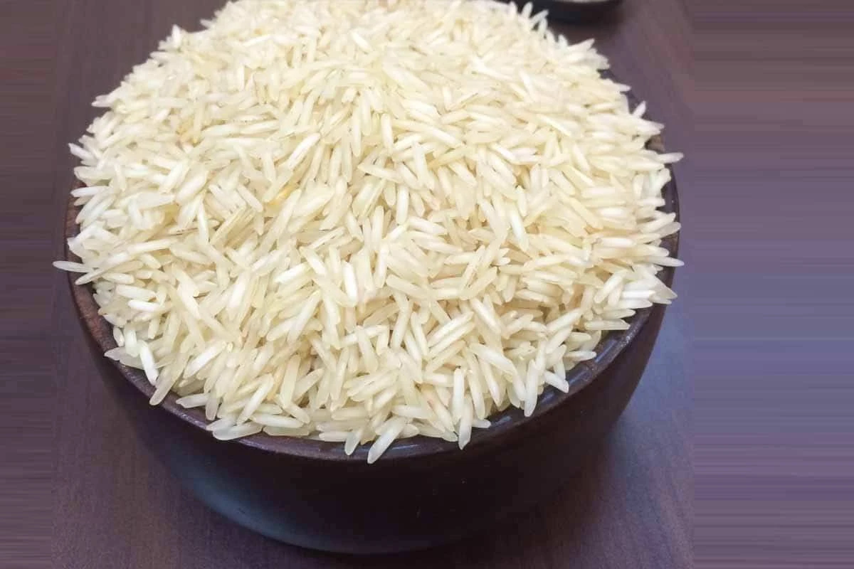
أكد ممثل قطاع المواد الغذائية في غرفة تجارة الأردن، جمال العمرو، أن المناوشات الجارية بين الهند وباكستان لن تؤثر على توفر أو أسعار مادة الأرز البسمتي في السوق الأردني، مشيراً إلى أن الإنتاج العالمي للأرز خلال العام 2025 كان مرتفعاً، مع مؤشرات أولية تؤكد أن الموسم الحالي مبشر، مما يعزز الاستقرار في العرض.

وأوضح العمرو لـ"الرأي" أن مناطق زراعة الأرز في الهند بعيدة عن منطقة كشمير التي تشهد التوتر، ولا توجد أي مشاكل حالياً في سلاسل التوريد أو الموانئ، لافتاً إلى أن حركة الشحن من الهند إلى ميناء جبل علي تتم بسلاسة خلال 7 أيام، عبر بواخر صغيرة وفيدرز تحمل نحو 120 حاوية، ما يسهل النقل بشكل أكبر مقارنة بالبواخر الكبيرة.

وبيّن أن واردات الأردن من الأرز البسمتي خلال عام 2024 بلغت نحو 250 ألف طن، في حين يبلغ معدل الاستهلاك المحلي ما بين 150 إلى 160 ألف طن سنوياً، مع توفر مخزون محلي يتراوح بين 70 إلى 80 ألف طن، يكفي لثلاثة أشهر، إضافة إلى كميات تم شحنها وستصل إلى ميناء العقبة خلال الأسبوع المقبل، مما يعكس استمرارية الشحن وعدم وجود أي انقطاع في التوريد.

وأكد العمرو أن الأرز في الأردن لا يقتصر على مصدر واحد، إذ يتم استيراده من عدة مناشئ تشمل الولايات المتحدة، الاتحاد الأوروبي، أستراليا، والأرجنتين، وهو ما يعزز من الأمن الغذائي ويخلق حالة من التنافس بين المستوردين تنعكس إيجاباً على الأسعار واستقرار السوق.

واختتم تصريحه بالتأكيد على أن السوق الأردني يتميز بصغر حجمه وسهولة تغطية احتياجاته، مع توفر مخزون ممتاز يبعث على الطمأنينة، ولا يوجد ما يدعو للقلق في الوقت الحالي ما لم تتطور الأوضاع بشكل كبير بين الهند وباكستان

.alrai-related-topic { width: 100%; } .alrai-related-topic .wrapper-row { gap: 27px; flex-wrap: nowrap } .alrai-related-topic .item-row { padding-right: 1px; width: 280px; } .alrai-related-topic .item-row .item-info { padding: 15px 15px 28px 16px; border: 1px solid rgba(211, 211, 211, 1); height: 118px; } .alrai-related-topic .item-row .item-info a { color: #000; color: color(display-p3 0 0 0); text-align: right; font-family: Almarai; font-size: 15px; font-style: normal; font-weight: 800; line-height: 25px; text-decoration: none; -webkit-line-clamp: 3; -webkit-box-orient: vertical; display: -webkit-box; overflow: hidden; } @media screen and (max-width:768px) { .alrai-related-topic .wrapper-row { flex-wrap: wrap } .container .row .col-md-9:has(.alrai-related-topic) { width: 100%; } .alrai-related-topic { margin-top: 10px; } .alrai-related-topic .item-row { width: 100%; } }
#Alrai_LB_01_HomePage_2 { width: 300px; height: 250px; background: color(display-p3 0.9333 0.9333 0.9333); margin:23px auto; } #widget_1895 #Alrai_MPU_01{ margin-top:42px;}
.alrai-culture-art-widget {border-right: 1px solid rgba(217, 217, 217, 1);padding-right:11px;} .alrai-culture-art-widget .title-widget-1 a{color: color(display-p3 0 0.6157 0.8745);text-align: right;font-family: 'Almarai';font-size: 24px;font-style: normal;font-weight: 800;line-height: 39px;text-decoration: none;padding-bottom: 5px;} .alrai-culture-art-widget .title-widget-1{margin-bottom: 26px;} .alrai-culture-art-widget .title-widget-1::after{content: "";position: absolute;left: 0;right: 0;bottom: 0;background: linear-gradient(90deg, rgba(0, 85, 121, 0.05) 0%, rgba(0, 157, 223, 1) 100%);z-index: 1;height: 3px;width: 100%;} .alrai-culture-art-widget .img-row{width: 100%;} .alrai-culture-art-widget .img-ratio{padding-bottom: 58%;} .alrai-culture-art-widget .item-info {padding: 23px 0} .alrai-culture-art-widget .item-info a{color: #000; color: color(display-p3 0 0 0); text-align: right; text-decoration: none;} .alrai-culture-art-widget .item-row:not(:first-child) > a{display: none;} .alrai-culture-art-widget .item-row a{color: #000;color: color(display-p3 0 0 0);text-align: right;text-decoration: none;-webkit-line-clamp: 3; -webkit-box-orient: vertical; display: -webkit-box; overflow: hidden;} .alrai-culture-art-widget .item-row:not(:last-child){border-bottom: 1px solid rgba(217, 217, 217, 1);} @media screen and (min-width:1200px){ #widget_1703 .alrai-culture-art-widget{border-right:0px;padding-right:0;} }
.alrai-epaper-widget{margin-top: 20px; max-width:250px}
Tweets by alrai
.alrai-facebook-embed{margin-top: 70px;}
#Alrai_LB_01_HomePage_2 { width: 300px; height: 250px; background: color(display-p3 0.9333 0.9333 0.9333); margin:23px auto; } #widget_1895 #Alrai_MPU_01{ margin-top:42px;}
#widget_2097 .alrai-section-last-widget {padding-top:35px;margin-top:0;} .alrai-section-last-widget .row-element .item-row .img-ratio{ display:flex; } /* Horizontal scroll container */ .alrai-section-last-widget .full-col { overflow-x: auto; overflow-y: hidden; -webkit-overflow-scrolling: touch; width: 100%; } /* Flex container - critical changes */ .alrai-section-last-widget .content-wrapper { display: flex; flex-direction: row; flex-wrap: nowrap; /* Prevent wrapping to new line */ align-items: stretch; width: max-content; /* Allow container to expand */ min-width: 100%; } /* Flex items */ .alrai-section-last-widget .item-row { flex: 0 0 auto; width: 200px; /* Fixed width or use min-width */ margin-right: 7px; display: flex; /* Maintain your flex structure */ flex-direction: column; } /* Text handling */ .alrai-section-last-widget .article-title { white-space: nowrap; /* Prevent text wrapping */ overflow: hidden; text-overflow: ellipsis; display: block; } /* Multi-line text truncation */ .alrai-section-last-widget .item-row .item-info a { display: -webkit-box; -webkit-line-clamp: 3; -webkit-box-orient: vertical; overflow: hidden; white-space: normal; /* Allows line breaks for truncation */ } /* Hide scrollbar */ .alrai-section-last-widget .full-col::-webkit-scrollbar { display: none; } @media screen and (min-width:1200px){ .alrai-section-last-widget::after { transform: translateX(0); } } @media screen and (max-width: 768px) { .alrai-section-last-widget .row-element .content-wrapper { flex-direction: row !important; } .alrai-section-last-widget::after{ transform: translateX(100%); right:0; left:0; } }
.death-statistics-marquee .breaking-news-wrapper {width: 100%;display: flex;} .death-statistics-marquee .breaking-news {background-color: #7C0000;padding: 22px 17px 24px 18px;color: #FFF;text-align: right;font-family: 'Almarai';font-size: 22px;font-weight: 700;line-height: 25px;} .death-statistics-marquee .breaking-news-content {background-color: #B90000;padding: 22px 18px 24px 21px;color: #FFF;text-align: right;font-family: 'Almarai';font-size: 22px;font-weight: 700;line-height: 25px;width: 100%;position: relative;} .full-container .marquee-container-widget:not(.relative-widget) .wrapper-row {position: fixed;width: 100%;right: 0px;bottom: 0px;z-index: 100000;} .death-statistics-marquee .marquee-container-widget .title-widget-2 {width: 75px;background-color: #757575;color: #fff;height: 60px;display: flex;align-items: center;justify-content: center;} .death-statistics-marquee .title-widget-2 a {color: #FFF;color: color(display-p3 1 1 1);text-align: right;font-family: 'Almarai';font-size: 15px;font-style: normal;font-weight: 700;line-height: 25px;padding: 16px 18px 16px 15px;text-decoration: none;display:block} .death-statistics-marquee .content-row:not(.content-row-full) {width: calc(100% - 100px);background-color: #000;} .death-statistics-marquee .content-row marquee {direction: ltr;} .death-statistics-marquee .content-row .img-item {display: inline-flex;height: 60px;align-items: center;vertical-align: top;} .death-statistics-marquee .content-row .article-title {height: 60px;display: inline-flex;align-items: center;color: #fff;padding: 0px 15px;direction: rtl;} .death-statistics-marquee .article-title a {color: #FFF;color: color(display-p3 1 1 1);text-align: right;font-family: Almarai;font-size: 17px;font-style: normal;font-weight: 700;line-height: 25px;text-decoration: none;} .death-statistics-marquee .title-widget-2 {width:100px} #widget_1932{position:static;bottom:0;width:100%;z-index:1}