#Alrai_LB_01_HomePage_full_ad { width: 728px; height: 90px; background: color(display-p3 0.9333 0.9333 0.9333); margin:0 auto; @media screen and (max-width:768px){ #Alrai_LB_01_HomePage_full_ad{ display: none } } }

استدعاء أكثر من مليوني قدر ضغط بسبب خطر الحروق

تاريخ النشر : الأحد 12:30 4-5-2025
No Image

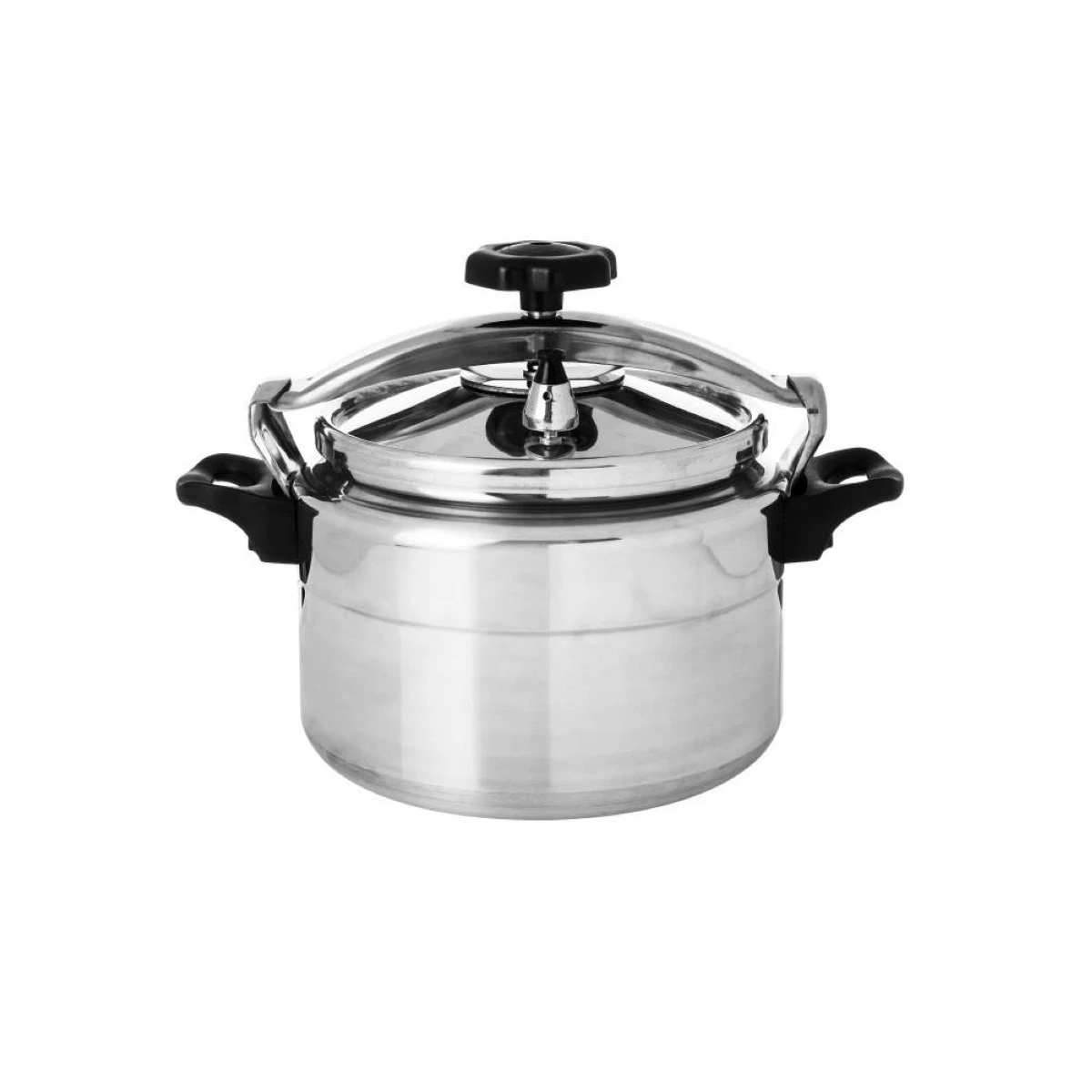
تواجه شركة SharkNinja عملية استدعاء واسعة تشمل أكثر من مليوني قدر ضغط بيعت في الولايات المتحدة وكندا، وذلك عقب تسجيل أكثر من 100 حالة إصابة بحروق ناجمة عن خلل في التصميم، قد يؤدي إلى تطاير الطعام الساخن خارج الجهاز أثناء الاستخدام.

ودعت لجنة سلامة المنتجات الأمريكية (CPSC) المستهلكين الذين يمتلكون الطرازات المشمولة في الاستدعاء بالتوقف فوراً عن استخدامها، والتواصل مع الشركة، التي تتخذ من ولاية ماساتشوستس مقراً لها، للحصول على غطاء بديل مجاناً، تفادياً لأي مخاطر محتملة.

ومع ذلك، لا يزال بالإمكان استخدام الوظائف الأخرى لقدور الضغط، مثل القلي بالهواء (Air Frying)، إذ لم تتأثر بالاستدعاء.

وفقاً لما ورد في قسم الأسئلة الشائعة على موقع "SharkNinja"، فإنه "لا حاجة لإعادة الجهاز إلى مكان شرائه"، من أجل الحصول على غطاء جديد، حيث سيتم التعامل مع جميع طلبات الاستبدال ضمن عملية الاستدعاء عبر الإنترنت فقط.

وتم تصنيع هذه القدور متعددة الاستخدام في الصين، وبيعت في الأسواق بين بداية عام 2019 وربيع عام 2025، وذلك عبر متاجر كبرى مثل: Walmart، وCostco، وSam’s Club، وAmazon، وTarget، بالإضافة إلى موقع Ninjakitchen.com، بسعر يقارب 200 دولار. وتحمل هذه المنتجات كلمة "Ninja" مطبوعة على الجهة الأمامية، وفقاً لوكالة أسوشيتد برس.

ويمكن للمستهلكين التأكد مما إذا كانت أجهزتهم مشمولة في الاستدعاء من خلال التحقق من ملصق المنتج، حيث تم نشر أرقام الطرازات المتأثرة في إشعارات الاستدعاء الصادرة يوم الخميس.

وتم بيع نحو 1.846.400 وحدة في الولايات المتحدة و184.240 وحدة في كندا، بالإضافة إلى عدد من الأغطية التي تم توزيعها سابقاً كقطع بديلة.

.alrai-related-topic { width: 100%; } .alrai-related-topic .wrapper-row { gap: 27px; flex-wrap: nowrap } .alrai-related-topic .item-row { padding-right: 1px; width: 280px; } .alrai-related-topic .item-row .item-info { padding: 15px 15px 28px 16px; border: 1px solid rgba(211, 211, 211, 1); height: 118px; } .alrai-related-topic .item-row .item-info a { color: #000; color: color(display-p3 0 0 0); text-align: right; font-family: Almarai; font-size: 15px; font-style: normal; font-weight: 800; line-height: 25px; text-decoration: none; -webkit-line-clamp: 3; -webkit-box-orient: vertical; display: -webkit-box; overflow: hidden; } @media screen and (max-width:768px) { .alrai-related-topic .wrapper-row { flex-wrap: wrap } .container .row .col-md-9:has(.alrai-related-topic) { width: 100%; } .alrai-related-topic { margin-top: 10px; } .alrai-related-topic .item-row { width: 100%; } }
#Alrai_LB_01_HomePage_2 { width: 300px; height: 250px; background: color(display-p3 0.9333 0.9333 0.9333); margin:23px auto; }
.alrai-culture-art-widget {border-right: 1px solid rgba(217, 217, 217, 1);padding-right:11px;} .alrai-culture-art-widget .title-widget-1 a{color: color(display-p3 0 0.6157 0.8745);text-align: right;font-family: 'Almarai';font-size: 24px;font-style: normal;font-weight: 800;line-height: 39px;text-decoration: none;padding-bottom: 5px;} .alrai-culture-art-widget .title-widget-1{margin-bottom: 26px;} .alrai-culture-art-widget .title-widget-1::after{content: "";position: absolute;left: 0;right: 0;bottom: 0;background: linear-gradient(90deg, rgba(0, 85, 121, 0.05) 0%, rgba(0, 157, 223, 1) 100%);z-index: 1;height: 3px;width: 100%;} .alrai-culture-art-widget .img-row{width: 100%;} .alrai-culture-art-widget .img-ratio{padding-bottom: 58%;} .alrai-culture-art-widget .item-info {padding: 23px 0} .alrai-culture-art-widget .item-info a{color: #000; color: color(display-p3 0 0 0); text-align: right; text-decoration: none;} .alrai-culture-art-widget .item-row:not(:first-child) > a{display: none;} .alrai-culture-art-widget .item-row a{color: #000;color: color(display-p3 0 0 0);text-align: right;text-decoration: none;-webkit-line-clamp: 3; -webkit-box-orient: vertical; display: -webkit-box; overflow: hidden;} .alrai-culture-art-widget .item-row:not(:last-child){border-bottom: 1px solid rgba(217, 217, 217, 1);} @media screen and (min-width:1200px){ #widget_1703 .alrai-culture-art-widget{border-right:0px;padding-right:0;} }
.alrai-epaper-widget{margin-top: 20px; max-width:250px}
Tweets by alrai
.alrai-facebook-embed{margin-top: 70px;}
#Alrai_LB_01_HomePage_2 { width: 300px; height: 250px; background: color(display-p3 0.9333 0.9333 0.9333); margin:23px auto; }
#widget_2097 .alrai-section-last-widget {padding-top:35px;margin-top:0;} .alrai-section-last-widget .row-element .item-row .img-ratio{ display:flex; } /* Horizontal scroll container */ .alrai-section-last-widget .full-col { overflow-x: auto; overflow-y: hidden; -webkit-overflow-scrolling: touch; width: 100%; } /* Flex container - critical changes */ .alrai-section-last-widget .content-wrapper { display: flex; flex-direction: row; flex-wrap: nowrap; /* Prevent wrapping to new line */ align-items: stretch; width: max-content; /* Allow container to expand */ min-width: 100%; } /* Flex items */ .alrai-section-last-widget .item-row { flex: 0 0 auto; width: 200px; /* Fixed width or use min-width */ margin-right: 7px; display: flex; /* Maintain your flex structure */ flex-direction: column; } /* Text handling */ .alrai-section-last-widget .article-title { white-space: nowrap; /* Prevent text wrapping */ overflow: hidden; text-overflow: ellipsis; display: block; } /* Multi-line text truncation */ .alrai-section-last-widget .item-row .item-info a { display: -webkit-box; -webkit-line-clamp: 3; -webkit-box-orient: vertical; overflow: hidden; white-space: normal; /* Allows line breaks for truncation */ } /* Hide scrollbar */ .alrai-section-last-widget .full-col::-webkit-scrollbar { display: none; } @media screen and (min-width:1200px){ .alrai-section-last-widget::after { transform: translateX(0); } } @media screen and (max-width: 768px) { .alrai-section-last-widget .row-element .content-wrapper { flex-direction: row !important; } .alrai-section-last-widget::after{ transform: translateX(100%); right:0; left:0; } }
.death-statistics-marquee .breaking-news-wrapper {width: 100%;display: flex;} .death-statistics-marquee .breaking-news {background-color: #7C0000;padding: 22px 17px 24px 18px;color: #FFF;text-align: right;font-family: 'Almarai';font-size: 22px;font-weight: 700;line-height: 25px;} .death-statistics-marquee .breaking-news-content {background-color: #B90000;padding: 22px 18px 24px 21px;color: #FFF;text-align: right;font-family: 'Almarai';font-size: 22px;font-weight: 700;line-height: 25px;width: 100%;position: relative;} .full-container .marquee-container-widget:not(.relative-widget) .wrapper-row {position: fixed;width: 100%;right: 0px;bottom: 0px;z-index: 100000;} .death-statistics-marquee .marquee-container-widget .title-widget-2 {width: 75px;background-color: #757575;color: #fff;height: 60px;display: flex;align-items: center;justify-content: center;} .death-statistics-marquee .title-widget-2 a {color: #FFF;color: color(display-p3 1 1 1);text-align: right;font-family: 'Almarai';font-size: 15px;font-style: normal;font-weight: 700;line-height: 25px;padding: 16px 18px 16px 15px;text-decoration: none;display:block} .death-statistics-marquee .content-row:not(.content-row-full) {width: calc(100% - 100px);background-color: #000;} .death-statistics-marquee .content-row marquee {direction: ltr;} .death-statistics-marquee .content-row .img-item {display: inline-flex;height: 60px;align-items: center;vertical-align: top;} .death-statistics-marquee .content-row .article-title {height: 60px;display: inline-flex;align-items: center;color: #fff;padding: 0px 15px;direction: rtl;} .death-statistics-marquee .article-title a {color: #FFF;color: color(display-p3 1 1 1);text-align: right;font-family: Almarai;font-size: 17px;font-style: normal;font-weight: 700;line-height: 25px;text-decoration: none;} .death-statistics-marquee .title-widget-2 {width:100px} #widget_1932{position:static;bottom:0;width:100%;z-index:1}