#Alrai_LB_01_HomePage_full_ad { width: 728px; height: 90px; background: color(display-p3 0.9333 0.9333 0.9333); margin:0 auto; @media screen and (max-width:768px){ #Alrai_LB_01_HomePage_full_ad{ display: none } } }

محكمة استئناف لندن تُصدر الجمعة قرارها في قضية حماية الأمير هاري

تاريخ النشر : الخميس 08:47 1-5-2025
No Image

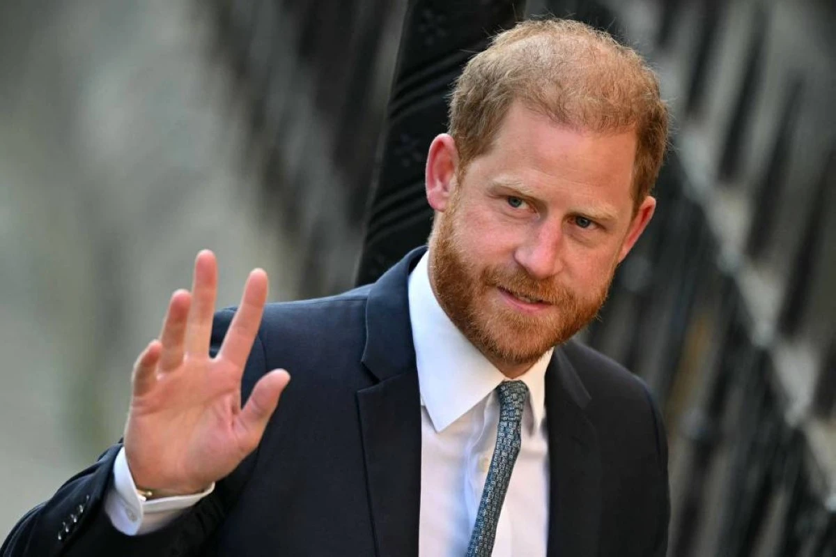
يُتوقع أن تنطق محكمة الاستئناف في لندن الجمعة، بحسب برنامجها، بحكمها في شأن الطعن الذي تقدّم به الأمير هاري الابن الأصغر لملك بريطانيا تشارلز الثالث في قرار يحرمه من توفير حماية أمنية له خلال زياراته للمملكة المتحدة.

فقد الأمير هاري وزوجته ميغن حقهما في الحماية الدائمة على حساب دافعي الضرائب البريطانيين، بعدما قررا الانسحاب من العائلة الملكية عام 2020 والاستقرار في الولايات المتحدة، إذ قررت وزارة الداخلية منحه الحماية على أساس كل حالة على حدة.

ورفع هاري (40 عاما) دعوى قضائية عام 2021 طعنا في القرار. وبعدما ردت محكمة الدرجة الأولى طلبه العام الفائت، استأنف الحكم.

وتُصدر المحكمة قرارها الجمعة اعتبارا من الساعة الثانية بعد الظهر (13,00 ت غ). ولم يتضح ما إذا كان هاري سيحضر جلسة النطق بالحكم، فهو نادرا ما يأتي إلى لندن ولكنه كان حاضرا في جلسة الاستماع في نيسان/أبريل.

وقالت وكيلة الأمير هاري المحامية شهيد فاطمة للمحكمة إن "هذا الاستئناف يتعلق بالحق الأكثر أساسيةً، وهو سلامة كل فرد وأمنه".

وفي اللوائح المكتوبة التي قدمها وكلاء هاري إلى المحكمة، أشاروا إلى تهديدات تهدد سلامة الأمير، مذكّرين بأن أبرزها "دعوة تنظيم القاعدة إلى قتله".

وأشار محامو دوق ساسكس أيضا في مذكرتهم إلى أنه وزوجته "تعرّضا لمطاردة خطيرة من مقتنصي الصور (باباراتزي) في مدينة نيويورك" في أيار/مايو 2023.

أما محامي الحكومة جيمس إيدي فشرح أن القرار لا يهدف إلى حرمان هاري الحماية تماما في المملكة المتحدة، بل إلى التأكيد أن "حمايته لن تستند إلى الأسس السابقة نفسها بسبب تغيير وضعه" وإقامته خارج المملكة المتحدة.

.alrai-related-topic { width: 100%; } .alrai-related-topic .wrapper-row { gap: 27px; flex-wrap: nowrap } .alrai-related-topic .item-row { padding-right: 1px; width: 280px; } .alrai-related-topic .item-row .item-info { padding: 15px 15px 28px 16px; border: 1px solid rgba(211, 211, 211, 1); height: 118px; } .alrai-related-topic .item-row .item-info a { color: #000; color: color(display-p3 0 0 0); text-align: right; font-family: Almarai; font-size: 15px; font-style: normal; font-weight: 800; line-height: 25px; text-decoration: none; -webkit-line-clamp: 3; -webkit-box-orient: vertical; display: -webkit-box; overflow: hidden; } @media screen and (max-width:768px) { .alrai-related-topic .wrapper-row { flex-wrap: wrap } .container .row .col-md-9:has(.alrai-related-topic) { width: 100%; } .alrai-related-topic { margin-top: 10px; } .alrai-related-topic .item-row { width: 100%; } }
#Alrai_LB_01_HomePage_2 { width: 300px; height: 250px; background: color(display-p3 0.9333 0.9333 0.9333); margin:23px auto; }
.alrai-culture-art-widget {border-right: 1px solid rgba(217, 217, 217, 1);padding-right:11px;} .alrai-culture-art-widget .title-widget-1 a{color: color(display-p3 0 0.6157 0.8745);text-align: right;font-family: 'Almarai';font-size: 24px;font-style: normal;font-weight: 800;line-height: 39px;text-decoration: none;padding-bottom: 5px;} .alrai-culture-art-widget .title-widget-1{margin-bottom: 26px;} .alrai-culture-art-widget .title-widget-1::after{content: "";position: absolute;left: 0;right: 0;bottom: 0;background: linear-gradient(90deg, rgba(0, 85, 121, 0.05) 0%, rgba(0, 157, 223, 1) 100%);z-index: 1;height: 3px;width: 100%;} .alrai-culture-art-widget .img-row{width: 100%;} .alrai-culture-art-widget .img-ratio{padding-bottom: 58%;} .alrai-culture-art-widget .item-info {padding: 23px 0} .alrai-culture-art-widget .item-info a{color: #000; color: color(display-p3 0 0 0); text-align: right; text-decoration: none;} .alrai-culture-art-widget .item-row:not(:first-child) > a{display: none;} .alrai-culture-art-widget .item-row a{color: #000;color: color(display-p3 0 0 0);text-align: right;text-decoration: none;-webkit-line-clamp: 3; -webkit-box-orient: vertical; display: -webkit-box; overflow: hidden;} .alrai-culture-art-widget .item-row:not(:last-child){border-bottom: 1px solid rgba(217, 217, 217, 1);} @media screen and (min-width:1200px){ #widget_1703 .alrai-culture-art-widget{border-right:0px;padding-right:0;} }
.alrai-epaper-widget{margin-top: 20px; max-width:250px}
Tweets by alrai
.alrai-facebook-embed{margin-top: 70px;}
#Alrai_LB_01_HomePage_2 { width: 300px; height: 250px; background: color(display-p3 0.9333 0.9333 0.9333); margin:23px auto; }
#widget_2097 .alrai-section-last-widget {padding-top:35px;margin-top:0;} .alrai-section-last-widget .row-element .item-row .img-ratio{ display:flex; } /* Horizontal scroll container */ .alrai-section-last-widget .full-col { overflow-x: auto; overflow-y: hidden; -webkit-overflow-scrolling: touch; width: 100%; } /* Flex container - critical changes */ .alrai-section-last-widget .content-wrapper { display: flex; flex-direction: row; flex-wrap: nowrap; /* Prevent wrapping to new line */ align-items: stretch; width: max-content; /* Allow container to expand */ min-width: 100%; } /* Flex items */ .alrai-section-last-widget .item-row { flex: 0 0 auto; width: 200px; /* Fixed width or use min-width */ margin-right: 7px; display: flex; /* Maintain your flex structure */ flex-direction: column; } /* Text handling */ .alrai-section-last-widget .article-title { white-space: nowrap; /* Prevent text wrapping */ overflow: hidden; text-overflow: ellipsis; display: block; } /* Multi-line text truncation */ .alrai-section-last-widget .item-row .item-info a { display: -webkit-box; -webkit-line-clamp: 3; -webkit-box-orient: vertical; overflow: hidden; white-space: normal; /* Allows line breaks for truncation */ } /* Hide scrollbar */ .alrai-section-last-widget .full-col::-webkit-scrollbar { display: none; } @media screen and (min-width:1200px){ .alrai-section-last-widget::after { transform: translateX(0); } } @media screen and (max-width: 768px) { .alrai-section-last-widget .row-element .content-wrapper { flex-direction: row !important; } .alrai-section-last-widget::after{ transform: translateX(100%); right:0; left:0; } }
.death-statistics-marquee .breaking-news-wrapper {width: 100%;display: flex;} .death-statistics-marquee .breaking-news {background-color: #7C0000;padding: 22px 17px 24px 18px;color: #FFF;text-align: right;font-family: 'Almarai';font-size: 22px;font-weight: 700;line-height: 25px;} .death-statistics-marquee .breaking-news-content {background-color: #B90000;padding: 22px 18px 24px 21px;color: #FFF;text-align: right;font-family: 'Almarai';font-size: 22px;font-weight: 700;line-height: 25px;width: 100%;position: relative;} .full-container .marquee-container-widget:not(.relative-widget) .wrapper-row {position: fixed;width: 100%;right: 0px;bottom: 0px;z-index: 100000;} .death-statistics-marquee .marquee-container-widget .title-widget-2 {width: 75px;background-color: #757575;color: #fff;height: 60px;display: flex;align-items: center;justify-content: center;} .death-statistics-marquee .title-widget-2 a {color: #FFF;color: color(display-p3 1 1 1);text-align: right;font-family: 'Almarai';font-size: 15px;font-style: normal;font-weight: 700;line-height: 25px;padding: 16px 18px 16px 15px;text-decoration: none;display:block} .death-statistics-marquee .content-row:not(.content-row-full) {width: calc(100% - 100px);background-color: #000;} .death-statistics-marquee .content-row marquee {direction: ltr;} .death-statistics-marquee .content-row .img-item {display: inline-flex;height: 60px;align-items: center;vertical-align: top;} .death-statistics-marquee .content-row .article-title {height: 60px;display: inline-flex;align-items: center;color: #fff;padding: 0px 15px;direction: rtl;} .death-statistics-marquee .article-title a {color: #FFF;color: color(display-p3 1 1 1);text-align: right;font-family: Almarai;font-size: 17px;font-style: normal;font-weight: 700;line-height: 25px;text-decoration: none;} .death-statistics-marquee .title-widget-2 {width:100px} #widget_1932{position:static;bottom:0;width:100%;z-index:1}