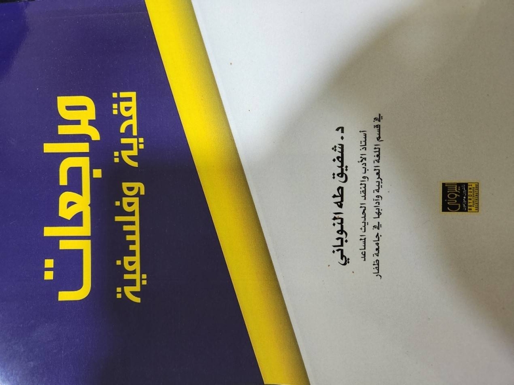
"مراجعات نقدية وفلسفية".. كتاب لشفيق النوباني

تاريخ النشر : الأحد 09:16 18-9-2022
No Image

صدر حديثا عن دار البيروني للنشر والتوزيع، كتاب بعنوان "مراجعات نقدية وفلسفية" للناقد الأردني د.شفيق النوباني.

احتوى الكتاب إحدى عشرة مقالة تناولت أحد عشر كتابا، فافتتح الكتاب بمقالة عن الفواصل القرآنية عرض المؤلف من خلالها لكتاب جاء تحت عنوان "مراعاة الفواصل القرآنية: دراسة أصولية نحوية" للدكتور أحمد بالخير، ثم تناول في المقالة الثانية كتاب صلاح فضل "أساليب الشعرية المعاصرة"، وفي المقالة الثالثة عرض لكتاب سعيد يقطين "قال الراوي"، وحاول في المقالة الرابعة أن يبرز المرجعية النظرية في كتاب غالي شكري "المنتمي- دراسات في أدب نجيب محفوظ".

وتناول النوباني في المقالتين الخامسة والسادسة كتابين لإبراهيم خليل أولهما "المثاقفة والمنهج في النقد الأدبي"، وثانيهما "محمود درويش قيثارة فلسطين". وعلى الرغم من أنه حاول استعراض فلسفة "كروتشه" من خلال عدد من المراجع في المقالة السابعة، إلا أنه اعتمد على كتاب "المجمل في فلسفة الفن" بصورة أساسية، فآثر ضم المقالة إلى هذا الكتاب، وهذا ما ينطبق على رؤية "باختين" النقدية في المقالة الثامنة؛ إذ اعتمد على كتابه "الخطاب الروائي" الذي ترجمه محمد برادة بوصفه مصدرا أساسيا.

واستعرض النوباني في المقالة التاسعة كتاب "نظرية الفوضى: ما بعد ما بعد الحداثة" لشريفة العبودي، أما المقالة العاشرة فتناول من خلالها كتاب عبد الله الغذامي "القبيلة والقبائلية أو هويات ما بعد الحداثة"، وتناول في المقالة الحادية عشرة كتاب "عودة الأنسنة في الفلسفة والأدب والسياسة" لجورج الفار.


.alrai-epaper-widget{margin-top: 20px; max-width:250px}
Tweets by alrai
.alrai-facebook-embed{margin-top: 70px;}
.container .row .col-md-12:has(.alrai-section-last-widget) { flex-direction: column; } .alrai-section-last-widget { margin: 0 auto; position: relative; padding-top: 35px; width: 100%; } #widget_2097 .alrai-section-last-widget { padding-top: 35px; margin-top: 0; } .alrai-section-last-widget::after { position: absolute; content: url("https://alrai.com/alraijordan/uploads/global_files/section-page-faded-line.svg?v=1"); top: 0; transform: translateX(0); } .alrai-section-last-widget .full-col { overflow-x: auto; overflow-y: hidden; -webkit-overflow-scrolling: touch; width: 100%; } .alrai-section-last-widget .row-element { width: 100%; } .alrai-section-last-widget .content-wrapper { display: flex; flex-direction: row; flex-wrap: nowrap; align-items: stretch; width: max-content; min-width: 100%; gap: 30px; justify-content: center; padding-top: 30px; } .alrai-section-last-widget .item-row { flex: 0 0 auto; width: 200px; margin-right: 7px; display: flex; flex-direction: column; height: 195px; } .alrai-section-last-widget .row-element .item-row .img-ratio { padding-bottom: 100%; display: flex; } .alrai-section-last-widget .row-element .item-row .img-ratio img { border-radius: 50%; border: 2px solid #00a0e5; padding: 3px; } .alrai-section-last-widget .article-title { white-space: nowrap; overflow: hidden; text-overflow: ellipsis; display: block; } .alrai-section-last-widget .item-row .item-info a { color: #000; color: color(display-p3 0 0 0); text-align: center; font-size: 14px; font-style: normal; font-weight: 800; line-height: 20px; text-decoration: none; display: -webkit-box; -webkit-line-clamp: 3; -webkit-box-orient: vertical; overflow: hidden; white-space: normal; } .alrai-section-last-widget .full-col::-webkit-scrollbar { display: none; } @media screen and (min-width: 1200px) { .alrai-section-last-widget::after { transform: translateX(0); } } @media screen and (max-width: 768px) { .alrai-section-last-widget .row-element .content-wrapper { flex-direction: row !important; } .alrai-section-last-widget::after { transform: translateX(100%); right: 0; left: 0; } }
.death-statistics-marquee .article-title a, .death-statistics-marquee .title-widget-2 a { text-align: right; font-family: Cairo; font-style: normal; font-weight: 700; line-height: 25px; text-decoration: none; } .death-statistics-marquee .breaking-news-wrapper { width: 100%; display: flex; } .death-statistics-marquee .breaking-news { background-color: #7c0000; padding: 22px 17px 24px 18px; color: #fff; text-align: right; font-family: Cairo; font-size: 22px; font-weight: 700; line-height: 25px; } .death-statistics-marquee .breaking-news-content { background-color: #b90000; padding: 22px 18px 24px 21px; color: #fff; text-align: right; font-family: Cairo; font-size: 22px; font-weight: 700; line-height: 25px; width: 100%; position: relative; } .full-container .marquee-container-widget:not(.relative-widget) .wrapper-row { position: fixed; width: 100%; right: 0; bottom: 0; z-index: 100000; } .death-statistics-marquee .marquee-container-widget .title-widget-2 { width: 75px; background-color: #757575; color: #fff; height: 60px; display: flex; align-items: center; justify-content: center; } .death-statistics-marquee .title-widget-2 a { color: #fff; color: color(display-p3 1 1 1); font-size: 15px; padding: 16px 18px 16px 15px; display: block; } .death-statistics-marquee .content-row:not(.content-row-full) { width: calc(100% - 100px); background-color: #000; } .death-statistics-marquee .content-row marquee { direction: ltr; } .death-statistics-marquee .content-row .img-item { display: inline-flex; height: 60px; align-items: center; vertical-align: top; } .death-statistics-marquee .content-row .article-title { height: 60px; display: inline-flex; align-items: center; color: #fff; padding: 0 15px; direction: rtl; } .death-statistics-marquee .article-title a { color: #fff; color: color(display-p3 1 1 1); font-size: 17px; } .death-statistics-marquee .title-widget-2 { width: 100px; } #widget_1932 { position: static; bottom: 0; width: 100%; z-index: 1; } @media scren and (max-width:768px){ .death-statistics-marquee .breaking-news-content{ font-family: 'Cairo', sans-serif; } }